
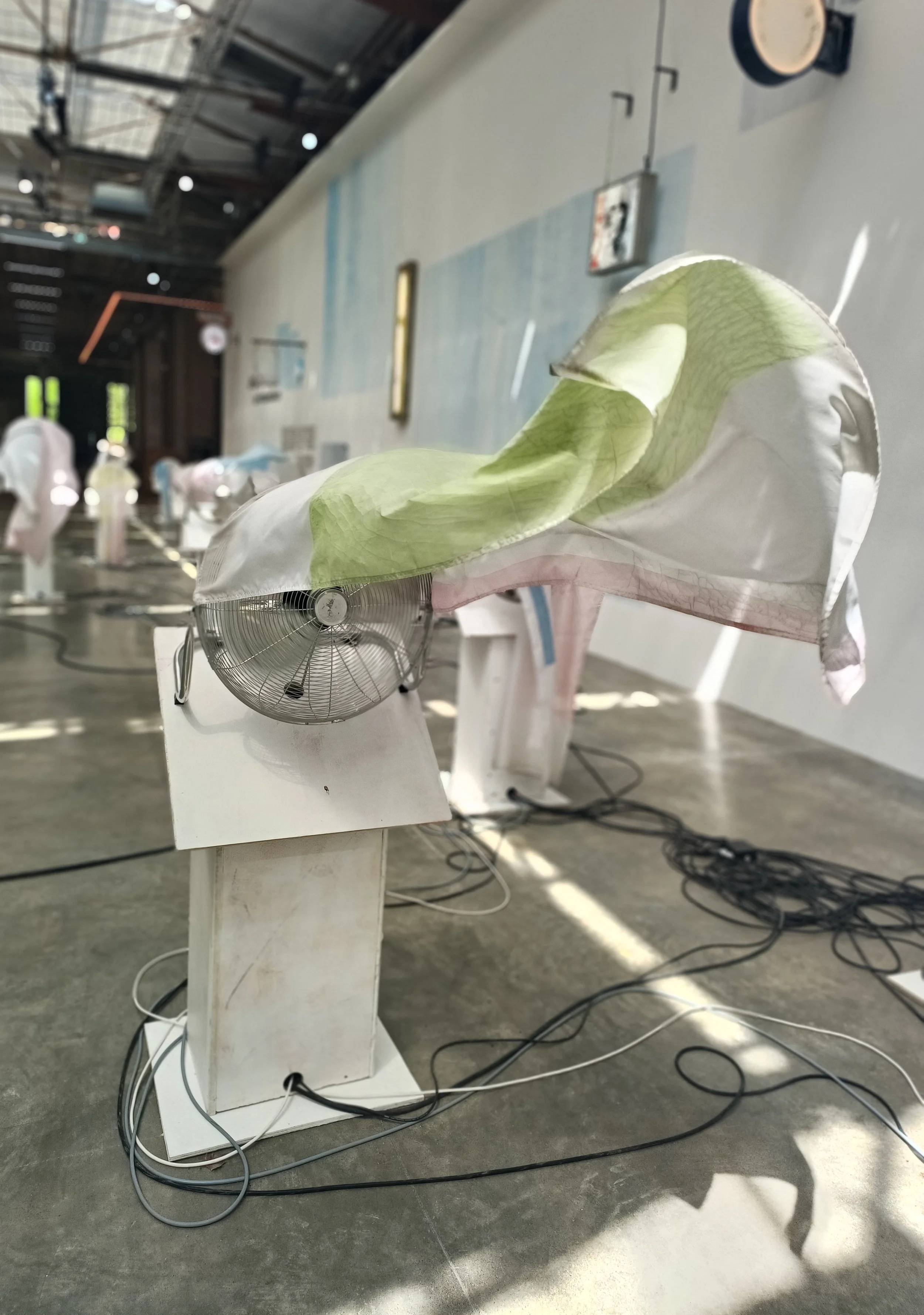
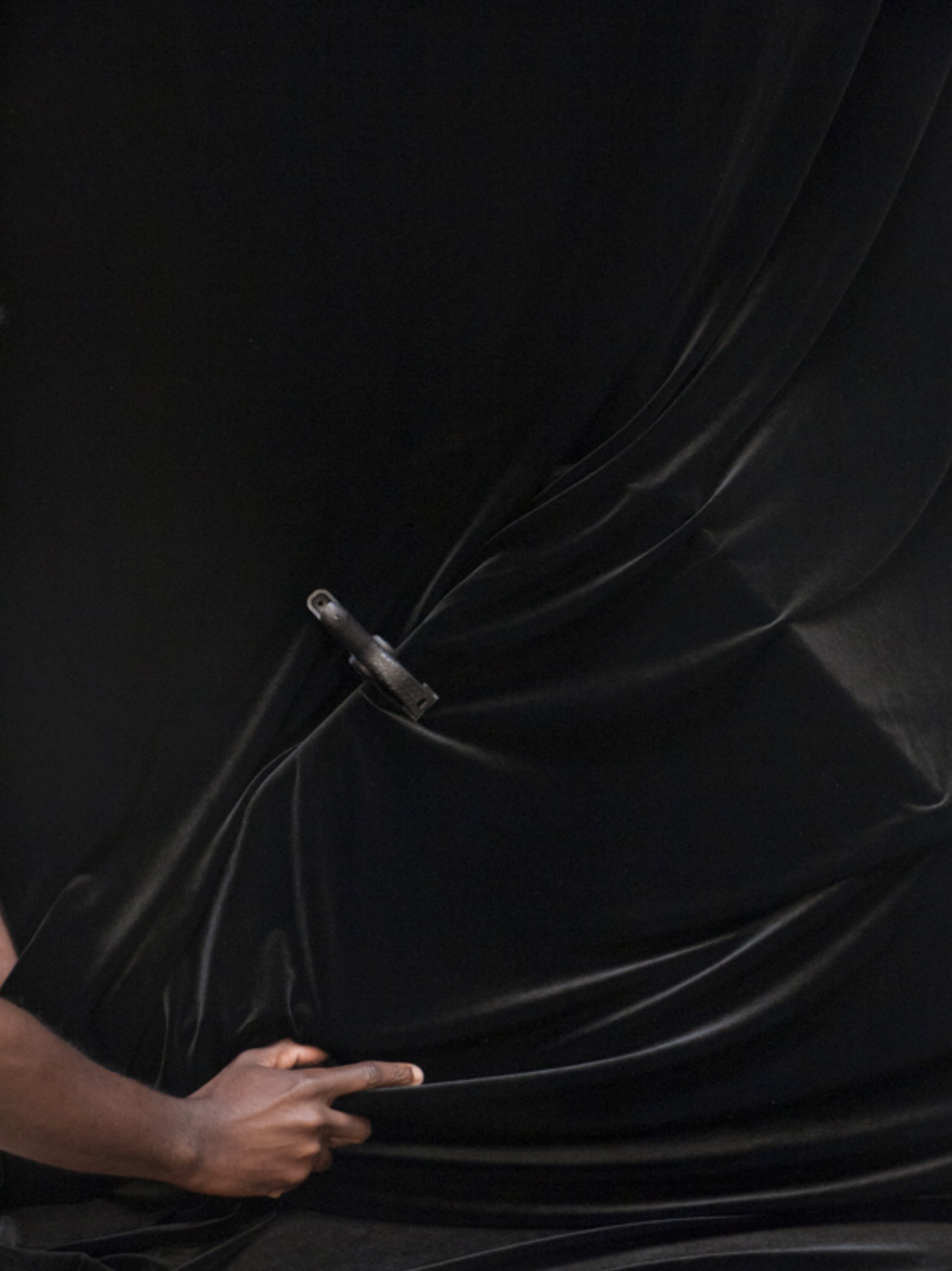
146. JESSE DARLING: A SPACE BETWEEN ON AND OFF.
Jesse Darling, Les Ambassadeurs, Palais de Tokyo - PARIS.
Jesse Darling, Les Ambassadeurs, Palais de Tokyo. Image: M-A (A SPACE BETWEEN).
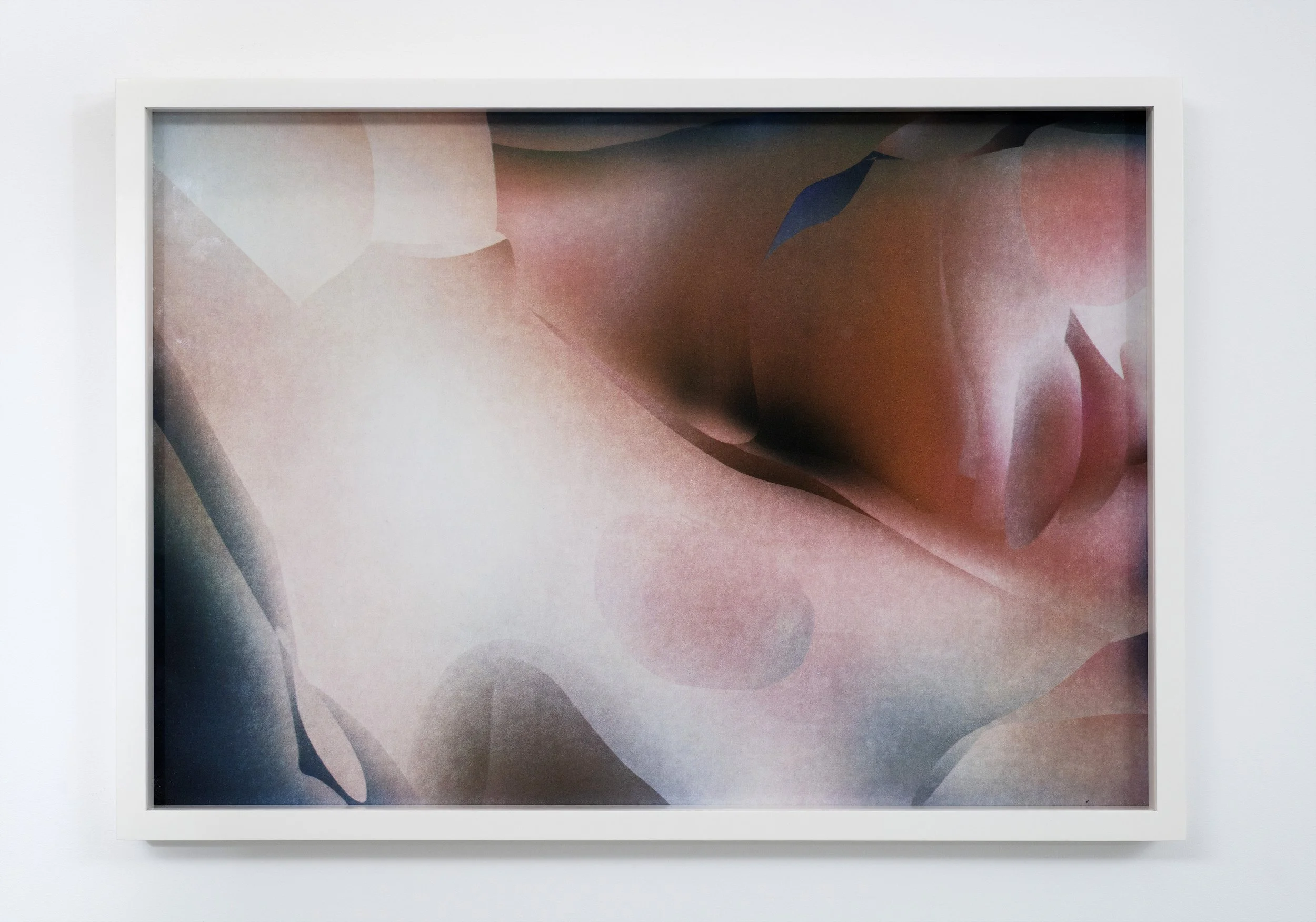
‘As each fan switches on and off, in action or inaction - the effects of each plinth's silhouette is transformed - performing one of two roles: Caped or swathed - superhero or priest - as to be saved or to be shrouded.
The effect en masse is both hypnotising and bewildering, as to view a swimmer from a distance, unsure if they are waving or drowning.’ M-A
As Paris burns in an unprecedented heatwave - and the prospect of even higher temperatures due in the coming weeks, there is a definite sense of threat to the city's nonchalant normality.
To chance upon Jesse Darling's fantastical 'Les Ambassadeurs', at Palais de Tokyo, seems an irresistible proposition of action in response to the effects of our collective climate crisis. The installation both soothes with immediacy and exposes a chilling warning, implied and within plain sight.
A conclave of caged electric fans, each affixed to a white-washed lectern - flutter with faded flags - horizontal as a windsock when unfurled, draped vertically when not, momentary stilled before each fan is activated.
The gentle hum is heard from this choir of motors, undulating in tone as to exhale and inhale, as a bodily rhythm of breath, restless and exhausted.
As each fan switches on and off, in action or inaction - the effects of each plinth's silhouette is transformed - performing one of two roles: Caped or swathed - superhero or priest - as to be saved or to be shrouded.
The effect en masse is both hypnotising and bewildering, as to view a swimmer from a distance, unsure if they are waving or drowning.
Electrical cables stream the floor, as dilated veins on the surface of skin, a natural reaction to lose heat and maintain a constant body temperature - a natural aim for equilibrium.
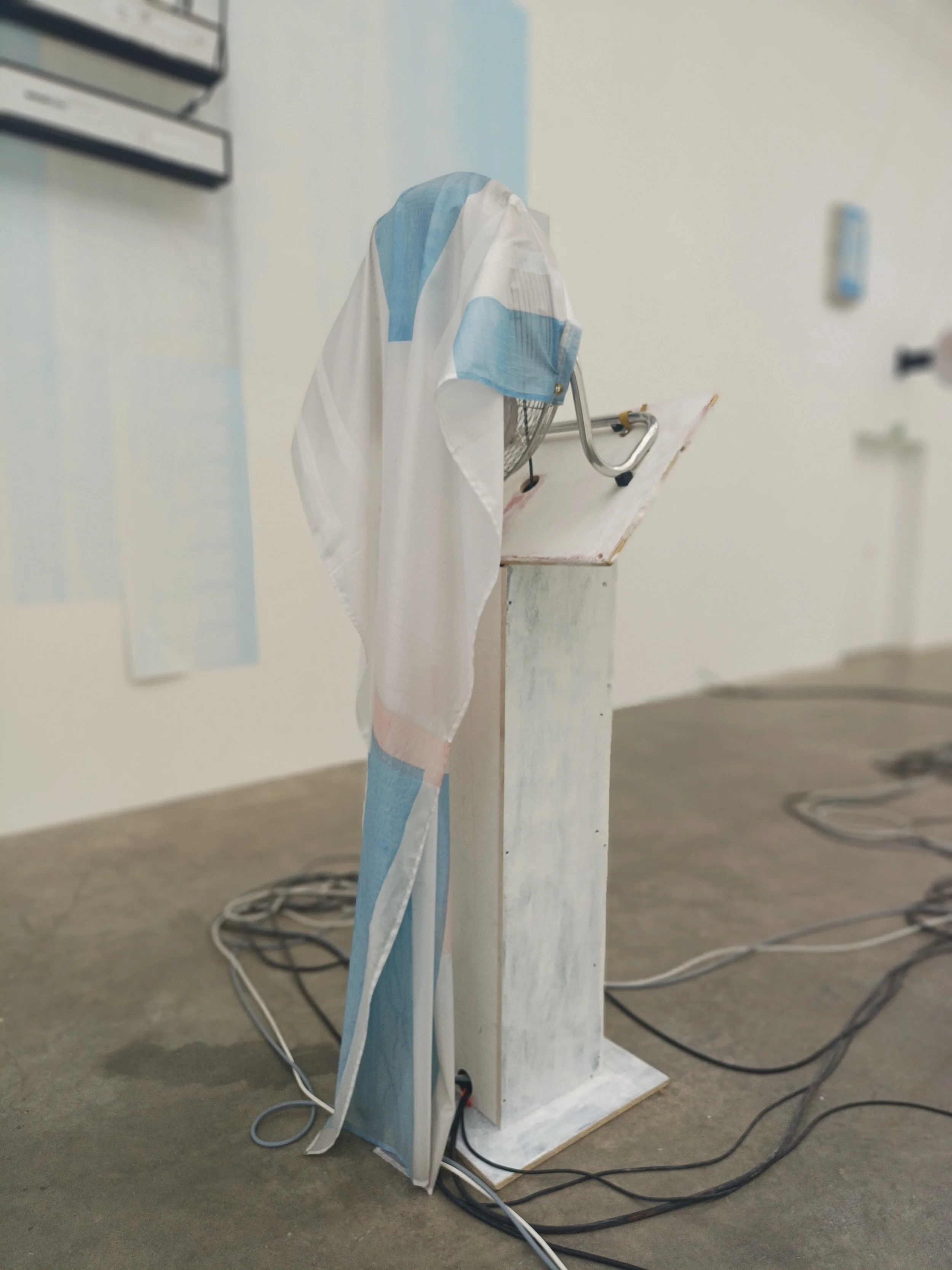
Jesse Darling, Les Ambassadeurs, Palais de Tokyo. Image: M-A (A SPACE BETWEEN).
The artist's choice of white fascinates, a texture akin to the milky wash or 'Blanc de Meudon' which the French have used to combat the recent heatwave - painting window panes to reflect sunlight and heat. A DIY solution made of chalk and water, which dries matte white. Within current conditions, both electric fans and chalk are currently in short supply and high demand - supporting Darling's reactive use of media - luxuriate in quantity within this presentation - adding to the notion of changing value and values within the artist's act of provocation.
Each flag, indistinguishable from the next, duly suggests unity and also confusion. To imagine a meeting of nations where every speech and action is the same.
The textile markings are reminiscent of the block colours used within the vestments created by Henri Matisse for the Vence Chapel, which the artist also decorated the interior, drawing across walls of domestic white tiles. Darling also proposes humble materials with thoughtful precision, evoking a unified, experiential installation which evokes a meditative pause within the familial domestic components of daily life.
As with Dan Flavin's work using fluorescent lighting equipment, proposing what cannot be seen as much as what can, so too does Darling explore the 'implied'. And it is here that the artist's use of the notion of inaction feels most provoking. The placid sense of choice - in switching the fan on and off is accepted as beyond the viewer's control, <not my department, not my problem>, and yet collectively, the effect of this active sense of benign responsibility adds to the unspoken, yet implied challenge - a call to action - as authority - as government, as religion. To wait for a decision to be made on how to act, how to behave and the assumption, the hope, the prayer of being saved.

Jesse Darling, Les Ambassadeurs, Palais de Tokyo. Image: M-A (A SPACE BETWEEN).
Jesse Darling Les Ambassadeurs Palais de Tokyo, Paris. Until 13 September 2026.
145. FRIDA KAHLO: A SPACE BETWEEN HEARING AND SEEING.
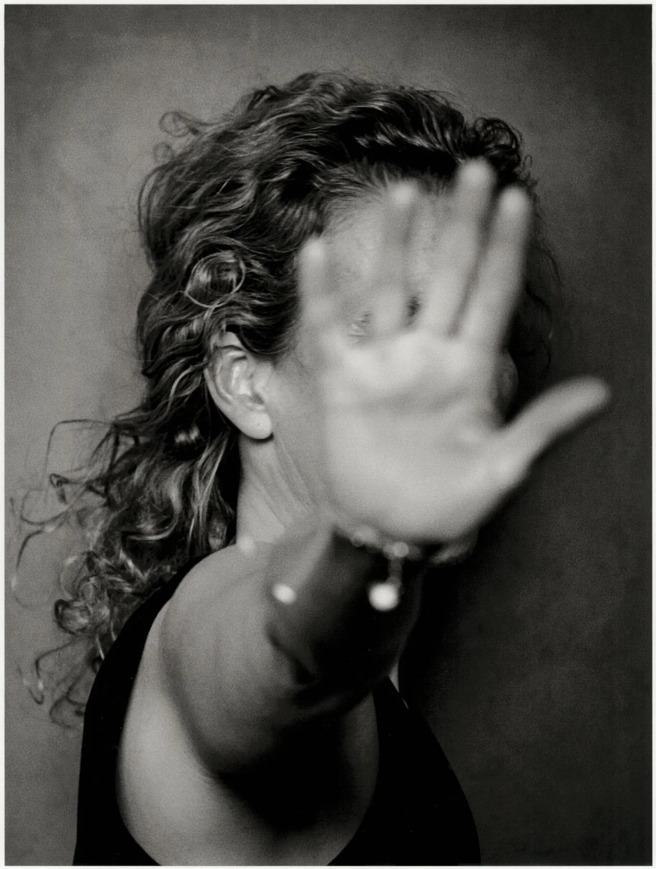
Frida: The Making of An Icon, Tate Modern - London.
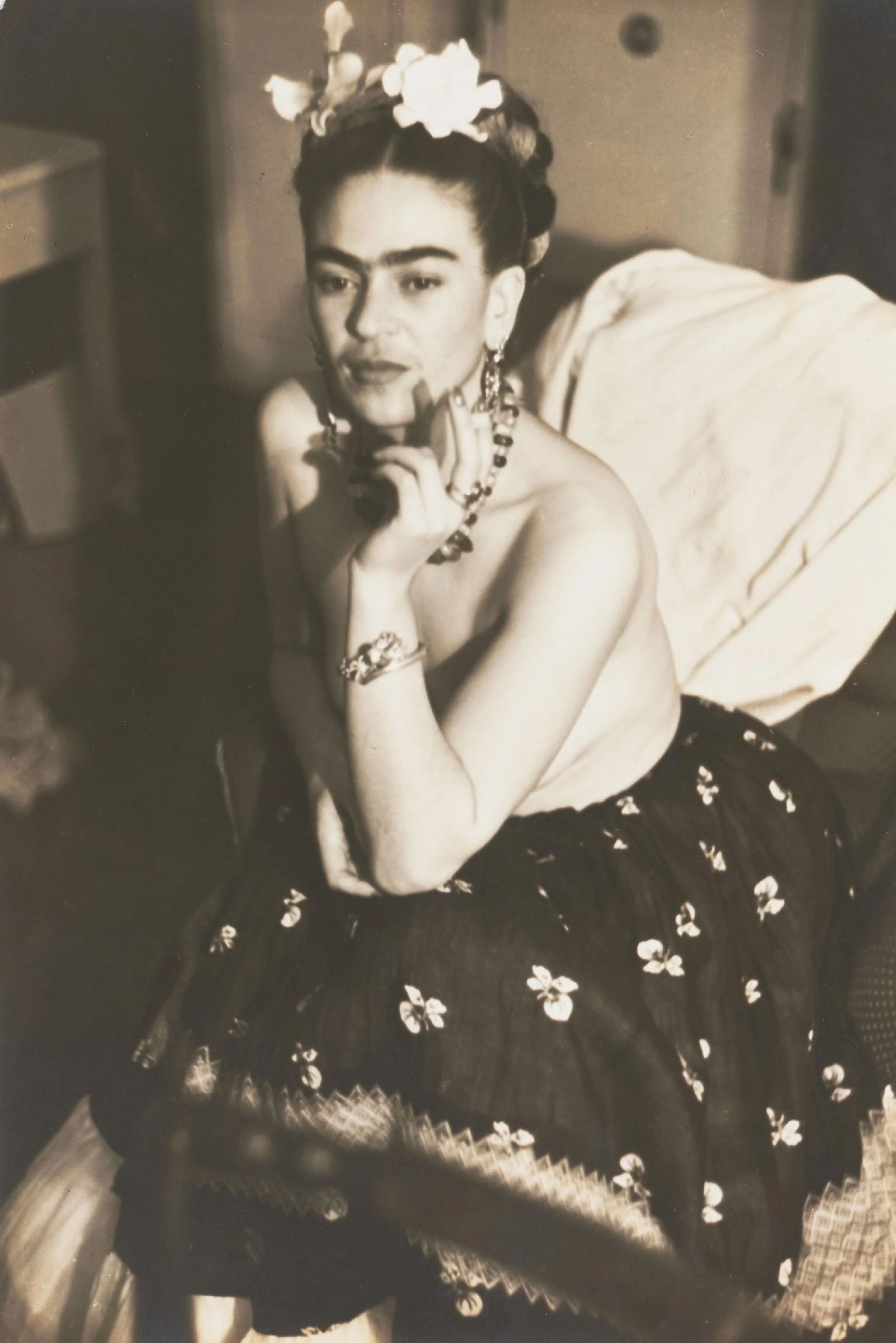
Frida Kahlo photographed by Julien Levy, 1938. © Courtesy Philadelphia Museum of Art.
…The calm host of photography underscores this presentation, allowing for the patience of clarity that Kahlo's consistent eyeline demands.
A continuum of black-and-white - depicting the artist and her shape-shifting silhouettes captured through multiple personas - thrilling and contradictory. M-A.
Which direction to contemplate Frida: The Making of an Icon? Kahlo's fixed stare locks my gaze from the first portrait, a photograph taken by the artist's father, fringed with palms and darkly shadowed within the protective walls of the Kahlo Hacienda. Exemplary of the atmospheric return to calm consistently sensed within the artist's work. Should I focus on the metaphorical appreciation of nature and the influence of the personification of Mexico—seen within landscapes, patination, and the costume of dress, bold and rhythmic in contradiction? Will the focus rest on community and personal culture? How the artist was informed and influenced by human contact within her life, despite predominantly being depicted alone. Should I follow the curatorial lead in terms of how the iconography of a person was formed and forged?
As I walk from room to room, magenta to teal, there is an ongoing tug, akin to the loyal reminder of one of Kahlo's pet dogs, pulling at her lace hem — to return, to return to instinct, which surely is at the heart of Kahlo's work as a whole and legacy.
Intriguingly, I feel that this exhibition played the role of the underdog from the outset; news leaked last year that large-scale paintings were proving challenging to obtain for the upcoming summer show. This seemed an obstacle that I assumed the Tate would overcome, providing a tantalising brief to sustain an exhibition to justify its title. This aim initially felt like an exciting curatorial prospect; however, the exclusion of such monuments to Kahlo's mythology is felt, resulting in a show that is reliant on a multitude of smaller works for substance and, in essence, attempts to fill this void. A further opportunity was missed due to the patchy rhythmic approach to scenography and cohesion of elements, which rely on the assortment of small works often dwarfed by the enormous rooms, where an inevitable echo chamber is created by voices other than Kahlo’s. The inclusion of such visionaries as Carrie Mae Weems and Ana Mendieta is well-meaning and yet somehow confusing within this exhibition.
There are jewels within this selection, however, namely 'Untitled (Self-Portrait with Thorn Necklace and Hummingbird), (1940), and 'Tunas (Still Life with Prickly Pear Fruit)' (1938), which help to tether the signifying power of Kahlo's intimacy with scale and composition. The pre-mentioned still life is richly contradictory and delights in the artist's taste for the perverse, as spliced bodily organs, bleeding as if to be extracted - held and awaiting on a domestic plate - as waves of cloth lap boyantly beneath, suggestive of a journeying raft of survival.
Thankfully, The calm host of photography underscores this presentation, allowing for the patience of clarity that Kahlo's consistent eyeline demands.
A continuum of black-and-white - depicting the artist and her shape-shifting silhouettes captured through multiple personas - thrilling and contradictory.
Exploring identities rooted in fantasy, realism and ethnicity, as container and contained - A sense of minimalism in exposing facets of self that are most arresting - devoid of decoration and stripped back to a self-exposed, dignified and raw as a sampling - rooted in heritage - primal in resistance to being tamed — It is here that Frida's iconic status burns brightest.'
When viewed today, these photographic depictions could be seen as subtle, even whimsical, and yet at the time of print, they were radical, and it is here that the real focus of the exhibition is held, even saved. To be your own muse, your own inspiration, both conceptually and physically. How an identity is constructed and how the framing and fashioning of a manipulated self is proposed. Captured by a series of intimate acquaintances whose portraits of the artist create a fascinating sense of collective consistency: Proposing a singular aesthetic — suggestive that Kahlo's decisive voice within the image controlled how she chose to be seen — is further suggestive of her ability to capture and package her own view - and her own brand I.P.
The exhibition as a whole, in comparison to current shows at Bourse de Commerceand Vuitton's Foundation in Paris, manages to capture the very spirit of discovery within collections presented—namely, Alexander Calder's monumental retrospective, where the museum's approach to scenography manages the weight of an archive with the lightness of a conductor's baton. Inviting generational awe without the repression of visual tone, which the Tate too often falls prey to. With every good intention, I wonder if, by trying to impress, the aim to present key works with improved clarity and space would allow the viewer to contemplate rather than to be entertained. And it is this that the aforementioned galleries understand.
There is 'something for everyone' within Frida: The Making of an Icon, and yet I long to witness the exhibition of 'everything of someone' and that being Frida themselves.
Ironically, the exhibition loops back on a hope that the viewer would learn anything other than what the gift shop's plethora of merchandise has to offer —and there is genuine sadness and artistic compromise within that thought. Kahlo's pedestaled position sustains financial streams of projection but not of the continuous states in which she was most revolutionary and brave in proposing.
Frida: The Making of An Icon, Tate Modern London. Until: 3 January 2027.
With thanks to Perry Stewart and Ekua McMorris.
144. ARMINEH NEGAHDARI: A SPACE BETWEEN BEING AND BECOMING.
"De quelle couleur est ton ciel aujourd’hui?" Fondation Louis Vuitton - PARIS.
Armineh Negahdari, À l'aube, à l'abri d'une fleur, 2026. Charcoal, pastel, and oil paint on cardboard. © Armineh Negahdari et Marcelle Alix, Paris Photo: © Fondation Louis Vuitton / David Bordes.
The way you touch the paper reminded me of a pool, of a surface of water which breaks - what does the surface of a work represent for you within your practice?
Drawing is a way of exploring an empty surface. Even in my sculptural work, I remain attentive to the surface. A flat frame in front of me feels like a territory of possibility, a place where what is not yet there can appear, non-being becomes being.
The description of drawing and writing meeting at certain moments - sounded fascinating - a point where one somehow takes over from the next and vice versa - please will you further express this notion of exchange within your creative process.
I often write things down, sometimes just a few words, sometimes sentences or poems I like. I occasionally return to them. There is a kind of certainty in words that images do not possess. Images seem to leave a path back for us, whereas words often do not; perhaps that is why I prefer drawing and images.
Not everything between me and my work can ever be fully understood, nor do I believe an artwork needs to be completely understood. Literature can bring us a little closer to it, poetry, for me, is the search for truth by way of a detour. But we never arrive at certainty. Certainty is an illusion.
Viewing the series within a single room, which are presented alongside the Alexander Calder exhibition, reminded me of entering a space of prayer. What is your feeling of being a part of that environment, and what have you learned from the work of Alexander Calder in viewing his work?
The first time I saw Calder’s work was as a teenager at the Museum of Contemporary Art in Tehran. A sculpture was suspended from the ceiling in the center of the museum, and on the floor there was a work by Noriyuki Haraguchi, Oil Pool. The colourful planes of Calder’s sculpture, like a drawing in space, deeply fascinated me. These living surfaces and lines, and the sense of balance and movement, filled me with excitement. The last time was during the exhibition at the Fondation Louis Vuitton, where I was moved by all these wonders. It felt as if Calder was holding space itself in his hands, drawing directly within it.
Seeing you work, I was reminded of a sense of returning, of a rhythm which forms a consistent whole. What do you return to within yourself when you draw?
The question is, is this movement inward? This return into oneself — and its result for me is an image. Who can ever say with certainty what it is a return to? What matters is that the return exists. I prefer simply to witness it, in a way, it is a reconnection with the source, with what lies at the depths of things. Art allows us to move beneath the surface and enter that depth.
Observing you work, via film and also seeing the pieces in person, there is an active sense of spontaneity which allows for a real sense of perceived freedom - I was drawn to the tiny faces within the drawings, which support a quiet focus, are there reappearing characters which reemerge within the works?
Everything repeats itself, transforms, and sometimes fades into forgetting. I have never tried to fully understand what these bodies convey. I prefer to keep moving forward, following the path that opens before me. Whatever lies behind me remains behind me. It seems spontaneous, it’s rooted in experience, I often visualize things beforehand or have ideas in mind, but the work itself tends to lead me in a different direction. I prefer to follow where the work takes me. we must be both very honest and willing to forget the ego, to allow the works to guide.
Open Space #18 Armineh Negahdari, Fondation Louis Vuitton - Paris.
Until 30th August 2026.
With thanks to Pierre-Edouard Moutin.
143. ALEXANDER CALDER: A SPACE BETWEEN EMOTION AND MOTION.
CALDER. Rêver en équilibre, Fondation Louis Vuitton - PARIS.
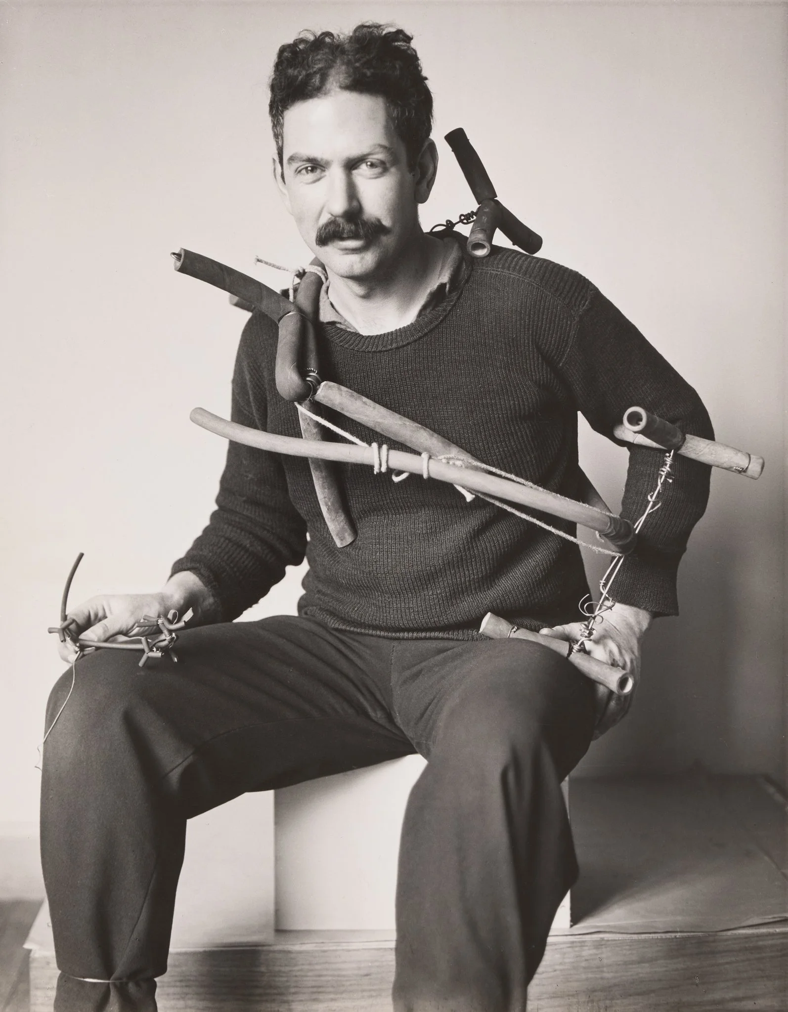
Alexander Calder avec Miss Tamara, Paris, 1929, by André Kertész. Source: Online.
Waves of wonder ripple Paris with an energy which radiates from the Frank Gehry created gallion of a foundation, anchored within a forest. Its sail-like structure billows with the force of nature, which is contained within its four floors. For Foundation Louis Vuitton, an empire built upon the values of travel, this sense of discovery is far-reaching - both within intention and creation: a retrospective of some 300 parts, by the American master of movement, Alexander Calder, an exhibition meticulously pieced together to form an overview of a new world order. Not a man's world - a child's.
The eyes of Calder, smile down upon each visitor on arrival within André Kertész's 1929 portrait of the artist as a young man - his body swaythed with the materials of his calling; pipes, rope and wire frame his torso - as to be festooned with reimagined victory laurals, the image also suggests breaking free from a shackle of prevention - either as symbol of future fame or as act of resistance, maybe both or neither and that is a quality of Calders' position and ambiguity of motive behind the meaning of a body of work which continues to fascinate and challenge.
The forming of a language is well evidenced - the dialogue of movement articulated through the physicality of metal to form the undulations of a continuum. Galleries testify to predate the arrival of Calder's breakthrough mobile forms - including early maquettes of circus scenes fashioned using the pliers believed to be a childhood Christmas gift in 1906. For his language of line, first uttered as a child and then refined in Paris as a young man, captures the awe of witnessing Josephine Baker's rhythmic movements, distilled within a single line - presented as a shaddowed twin - reverberating as a record on the gallery wall. His tremulous depictions of movement - solidified in permanence, archive space, and when viewed today, as at the time of making - resolutely communicate the emotion of motion without the stoicism of academia. For the scientist and mathematician in Calder knew that his way forward was to continue a loyalty to line via connection to the cosmos. Early undulations of movable parts made during his Paris revolutionary years softly orbit, seen on show as evocations of solar systems, directly informed by Albert Einstein’s theories of relativity, a published work that the artist was to reimagine in his own language of metal movements.
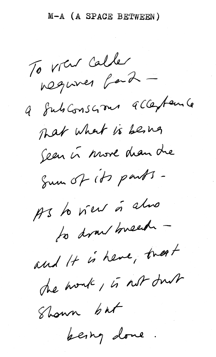
To view Calder requires faith - a subconscious acceptance that what is being seen is more than the sum of its parts. As to view is also to draw breath - and it is here that the work, is not just being shown, but being done.
Splaying from a spine, evoking the immediacy of nature, as leaf, mamel or the rippled surface of a pool - all are connected within Calder's all-sensing state of impulse. An inversion of a world - as to look into a murcurial mirror of calm - where an alternative life stretches to arc - from mechanised as rigid to undulate a smile. The viewer knows that they are looking at industrial materials, re-fashioned by one pair of hands - and yet - the work evokes such deep understanding of the organic as to become another sort of nature - it is as if, the work stimulates an ancient, ancestral memory which pauses time and aligns our humility to focus.
The notion of levitation within the works are central to the artist's specificity of atmosphere, as a consistent rhythm which is sensed as a calm heartbeat throughout the exhibition as a whole. Isaac Newton's law of action and reaction distils: For every action, there is an equal and opposite reaction - and so, through the work, the viewer too embodies this state of calm equilibrium.
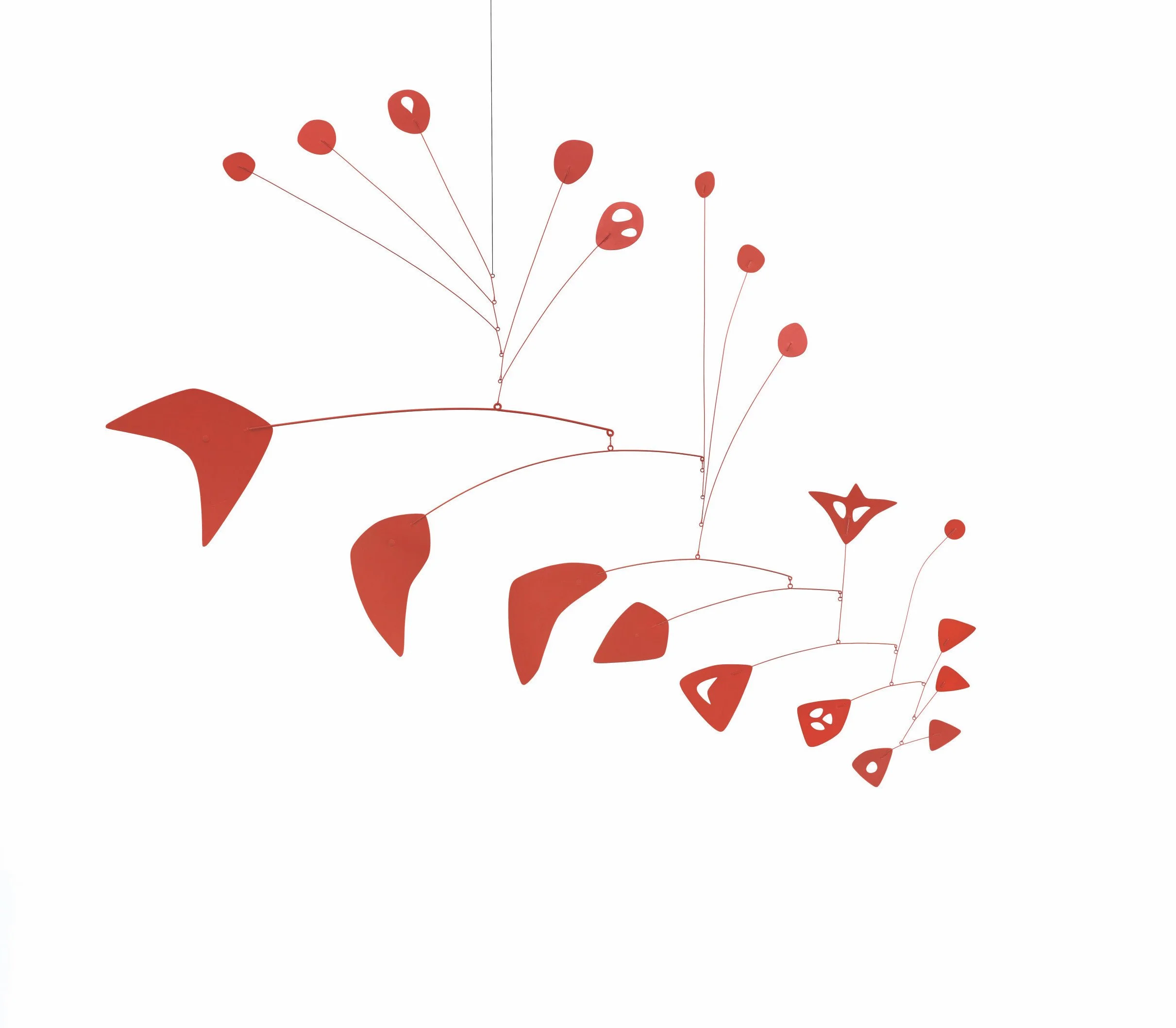
Alexander Calder, Red Maze III, 1954, Feuille de métal, fil de fer et peinture, 142,2 x 182,9 cm, Calder Foundation, New York © 2026 Calder Foundation, New York / ADAGP, Paris. Photo courtesy of Calder Foundation, New York / Art Resource, New York.
CALDER. Rêver en équilibre, Fondation Louis Vuitton Paris. Until 16 August 2026.
With thanks to Pierre-Edouard Moutin.
142. ANGELA SANTANA: A SPACE BETWEEN DESIRE AND RECORD.
AMOCA Dialogues - Cardiff.
Angela Santana, Speaking in Tongues, 2024, Oil on canvas. 65 1/2 × 116 in. Image courtesy of the artist.
‘For me,(my work) represents a site of resistance. My subjects are unapologetic and exist entirely on their own terms, challenging the status quo. A continuum, a dialogue with the past and the future… It’s about holding opposing forces in the same frame until they vibrate, ensuring the viewer never feels quite settled, but remains completely captivated.’ A.S.
The sense of fracturing, of a multi-faceted perspective, really is intriguing when viewing your work. Please can you contemplate the sense of perspective within your practice?
At the heart of it lies a desire not to record reality, but to reimagine it. While Brunelleschi’s Renaissance system of linear perspective offers a satisfying mathematical accuracy, it is too fixed for the world I am envisioning. I had to develop my own system — a multi-faceted perspective that allows for the 'in-between.' It creates a space where movement, the coming together, and the falling apart can all exist at once.
I immediately think of Tamara de Lempicka when I see your work, this sense of shifting - pivoting between movements, between times, which artists have inspired and informed your point of view?
A sense of shifting is a good way to describe it. For me, that movement stems from an absolute urge to express something that I haven’t seen around me, but knew needed to come to the surface.
I find myself most drawn to works that bridge the gap between immediate impression and psychological depth. Louise Bourgeois for her raw, emotional architecture and sensuality, for example, Eadweard Muybridge for his obsession with the mechanics of motion and the breakdown of time, and David Lynch for his ability to make the subconscious feel physically present. They all share a fascination with what lies beneath the surface, which is exactly where my process begins.
What do you feel your work as a whole represents?
To me, (the work) represents a site of resistance. My subjects are unapologetic and exist entirely on their own terms, challenging the status quo. A continuum, a dialogue with the past and the future.
There is a complex polarising quality within your work, of a sensual feeling of caress and also a splintering which feels hard-edged. Please can you explore the sense of synaesthesia within your work?
I am always striving for that elusive equilibrium — a state of friction where the familiar and the unsettling collide. I aim for a quality I call 'Umami': a complex, rich experience with layers that refuse to reveal themselves all at once, unfolding only over time. It is something incredibly alluring, yet indescribably strange.
I want the work to live in that high-stakes friction. It’s about holding opposing forces in the same frame until they vibrate, ensuring the viewer never feels quite settled, but remains completely captivated.
By presenting the mundane with the same monumental weight as the grand, I embed an absurdity that refuses to apologise. This irreverence creates a restless energy, a mix of joy and subversion that forces an active, perhaps even uncomfortable, reconsideration of the world around us.
The fetishised body is a topic which is rooted in the history of art. Today, we are faced with depictions of this subject at an increasing speed due to digital means. How do you feel about this, and what does the fetishised body mean to you?
When I began this series over a decade ago, I was very aware that the increasing flood of images of the body would have an impact on us and alter our collective consciousness. While the body has always been my primary subject, this seismic shift toward digital ubiquity introduced new conceptual and psychological layers to how we perceive ourselves and the world around us.
For me, the fetishised body is less about the image itself and more about the mechanisms of influence behind it. I am observing the rapid circulation and consumption of these images — how their 'liquid' nature online masks deeply embedded biases and rigid power structures.
I view my practice as a form of visual archaeology. By translating these fleeting, often distorted digital artefacts into the slow, permanent medium of oil paint, I am able to peel back the layers of contemporary media and look beneath the surface. The sediment they leave behind ultimately mirrors the human condition.
Angela Santana, Elation, 2022, Etching, Ink on paper, 17 × 24 in.
141. EDGARD DE SOUZA: A SPACE BETWEEN SIZE AND LOAD.
Galeria Vermelho, São Paulo.
Edgard de Souza, Travesseiro (Pillow), 1991, Lacquered wood, 80 x 110 x 27 cm. Courtesy of the artist and Galeria Vermelho.
‘I think it is time for a rupture to establish a new order, a new way to relate to art and to life…’ Edgard de Souza.
There are certain historical contexts to your works, which are fascinating. How materials actively seem to resist categorisation, which feels like punk energy, and ultimately speak of freedom. Of amorphous, undulations of bodies in bronze appearing to be within a process of melding within a reflection, of textures of fur which blur information which seems predatory and in drawings which push the surface into another space - of saturation... Please can you contemplate your relationship with materials within your practice?
My first approach to materials is always functional; I mean that the project will determine what material should be used. Eventually the scraps will suggest new ideas, for instance the cow hide was first used for the upholstery of animal like furniture objects, then the first vessels were made from the scraps ( i try to be respectful to the animal skin and try to use the most of it), then I noticed the branding on these cow hides which led me to the "Fake Spot" series. I started to photograph myself to serve as studies and references to the bronze figures, but then I printed some of these images as finished works. So materials are chosen to serve a purpose; they are not the starting point. I love oil paints, but the last time I had a project to use them was in 1994.
The sense of time within your work is very specific - the often immediate feeling of provocation and the slower, more restful sense of classical beauty which sustains memory. What is your relationship with time, and how does it affect your choices as an artist?
Time is a problem. One artist living under the capitalist system has to produce a lot, network a lot, exhibit a lot, fast, fast, fast. I don't do any of these things, I work slowly and procrastinate a lot. This condition always caused me immense anxiety and I needed to grow old before I could feel completely comfortable about it. So even against all odds I always chose to stay true to the work, even at a loss. I try to not rush with the work, I don't commit to an exhibition if I have nothing, I don't adjust my speech to meet curatorial trends. At this point, I feel lucky enough to survive just by keeping a certain positive reputation without pursuing career anymore.
There is a certain sense of volumes of vessels which are presented as measures, of containers which consistently appear empty and yet appear specific in scale and form - what do you return to measure?
The scale of the vessels is determined by the size of the skin, or what was left of it. I see them as hollow bodies, as mummies, that could contain a soul or some kind of spirit, something which is not measurable. Of course, one could have a more sexual interpretation of these vessels - then we could talk about sizes and loads... I do 'play' with scale regarding the bronze figures; they are smaller than life size, but it tricks our eyes depending on how and where they are installed, sometimes they look bigger, sometimes smaller than they actually are.
Observing your works, there is a specific sense of order and of re- organisation of values which shift from an expected reality. Both in terms of how works are positioned and also in terms of the materiality of their realisation. Please can you contemplate the sense of order within your practice?
Maybe this organisation and reorganisation of values, which shift from an expected reality, as you put it, reflects the attempt to introduce subliminal messages into the work; of course, that will function depending much on the viewer's background. Like taking a sexual or even a violent subject and materialising it as a cute and polished object helps to introduce these themes into conservative collections, that amuses me.
I am not sure if metaphors and subliminal messages still make sense in a world where corporate media is causing collective cognitive dissonance. So lately I've been carrying this feeling of uselessness on trying to order or re-order things, I think it is time for a rupture to establish a new order, a new way to relate to art and to life, other than the 'market', but it is still what we've got and have to deal with.
Edgard de Souza is a contributor to M-A (A SPACE BETWEEN) issue 5. The complete interview and image series will be published within the issue, which will be presented in the autumn of 2026.
With thanks to Marcos Gallon.
140. NICOLA ERNI: A SPACE BETWEEN DRIVE AND JOY.
Mix and Match: Fashion Photography Meets Contemporary Art -.Nicola Erni Collection - Steinhausen,
SWITZERLAND.
Nicola Erni © Peter Lindbergh.
‘My vision is to make the art world aware that fashion photography and contemporary art do meet on (the same) eye level…’
Nicola Erni.
The Nicola Erni Collection is a powerful example of instinctive choices and creative release, appearing as a home where visitors experience images, objects and are invited to contemplate within a series of spaces. When you are responding to the choices to realise this space, what were the signalling moments in its realisation?
When we were planning the first collection building in 2010, the focus was really to design a space around the collection at that time – large rooms to install the paintings by Julian Schnabel, Robert Rauschenberg, etc. and different smaller rooms for the photography collection, especially Zeitgeist & Glamour. I never thought of a classical museum but rather an «extended living room.» The second building, finished in 2020, has a different approach. The focus was more on the architecture and the idea of creating an artwork to experience all the different levels and perspectives of the open rooms. Talking about interior design, I really wanted to feel joy when looking at the collection and feel ‘at home’. By having colourful walls, cosy sofa launches, well-curated interior design in “high and low style”, and playing with textiles and patterns, I want to make people feel at ease when they come to experience the Nicola Erni Collection. There is always music playing, and books and magazines are lying around. For me, this is the soul of the space. Giving people the feeling of being welcome, immersing themselves in another atmosphere and showing them a different philosophy of presenting art.
The role of the collector and custodian is historically important and notable for creative industries. Do you feel your role has changed within your journey?
Yes, definitely! For a long time, I didn’t even consider myself a collector. So the way I viewed myself changed too. Now, as the Nicola Erni Collection is involved in international exhibitions through its loan programme and publishes books lately with the publishing house Phaidon, I see how we can support artists by giving them a platform or helping them make important connections. My eye has developed further through the era, and I look at art differently today than 20 years ago. Because the collection has grown massively over the years, I can combine all the genres differently and set those in amazing new contexts. The best example is “Mix & Match”.
You are known and respected as being a champion for artists. What would you like your legacy to be?
What a compliment, thank you! You know, an important part of my collection is on fashion photography. It covers almost 100 years of fashion photography and is also an important topic of the current exhibition and the accompanying publication ‘Mix and Match: Fashion Photography Meets Contemporary Art.’ I really want society to understand the importance of this medium, and how much cultural reflection and input is in it. My vision is to make the art world aware that fashion photography and contemporary art do meet on (the same) eye level and enter a dialogue, if they are juxtaposed; to bring the mix of those two genre to international institutions, and also to make museums and galleries aware of presenting art in a more welcoming way with furniture, colors and lounges in the exhibition rooms where the visitors can sit comfortably and feel at ease. To give the visitor a real experience! If this will be my legacy, I am very happy.
Mix and Match: Fashion Photography Meets Contemporary Art - Nicola Erni Collection: Erlenweg 2/5, 6312 Steinhausen, Switzerland.
Nicola Erni is a contributor to M-A (A SPACE BETWEEN) issue 5. The complete interview will be published within the issue, which will be presented in the autumn of 2026.
With thanks to Nicola Erni, Nadine Dinter and Giannina Mosimann.
139. MARTIN MARGIELA: A SPACE BETWEEN BEFORE AND AFTER.
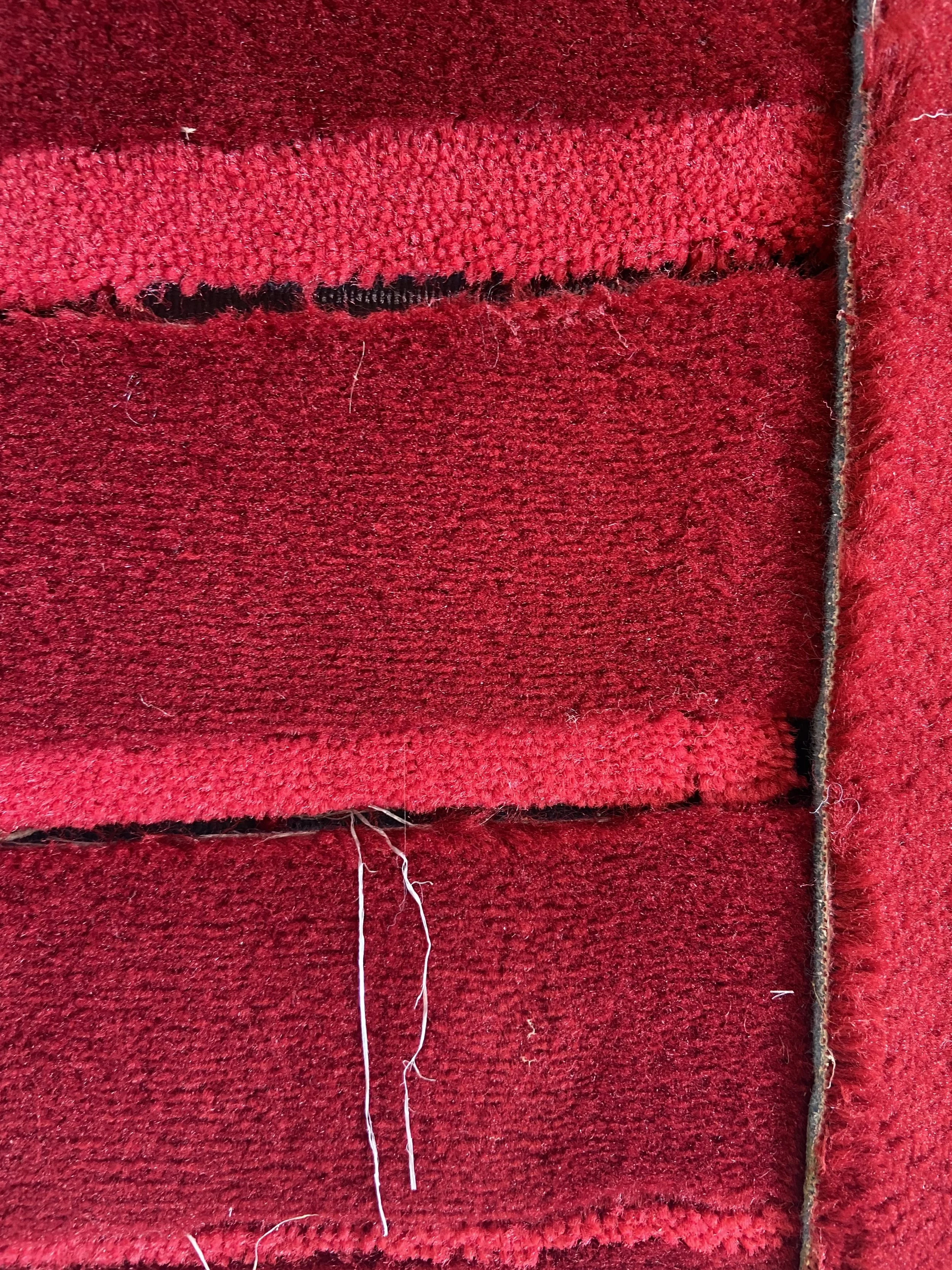
Martin Margiela, ‘Fragment of Red Steps II’, 2023. Carpet on canvas on wooden frame, 191.5 × 111.5cm. Martin Margiela, All images © Martin Margiela. All artworks with the courtesy of the artist and Gallery Bernier-Eliades.
‘When failure happens, I am extremely alert.
It is a precious moment because it cannot be organised, I can discover a new approach to the same subject.
I often experience that the final result turns out better than the original idea, so I feel blessed.’
Martin Margiela.
The full interview with Martin Margiela, along with photography of the artist’s works, specially created for the issue, is published within issue 4 of M-A (A SPACE BETWEEN).
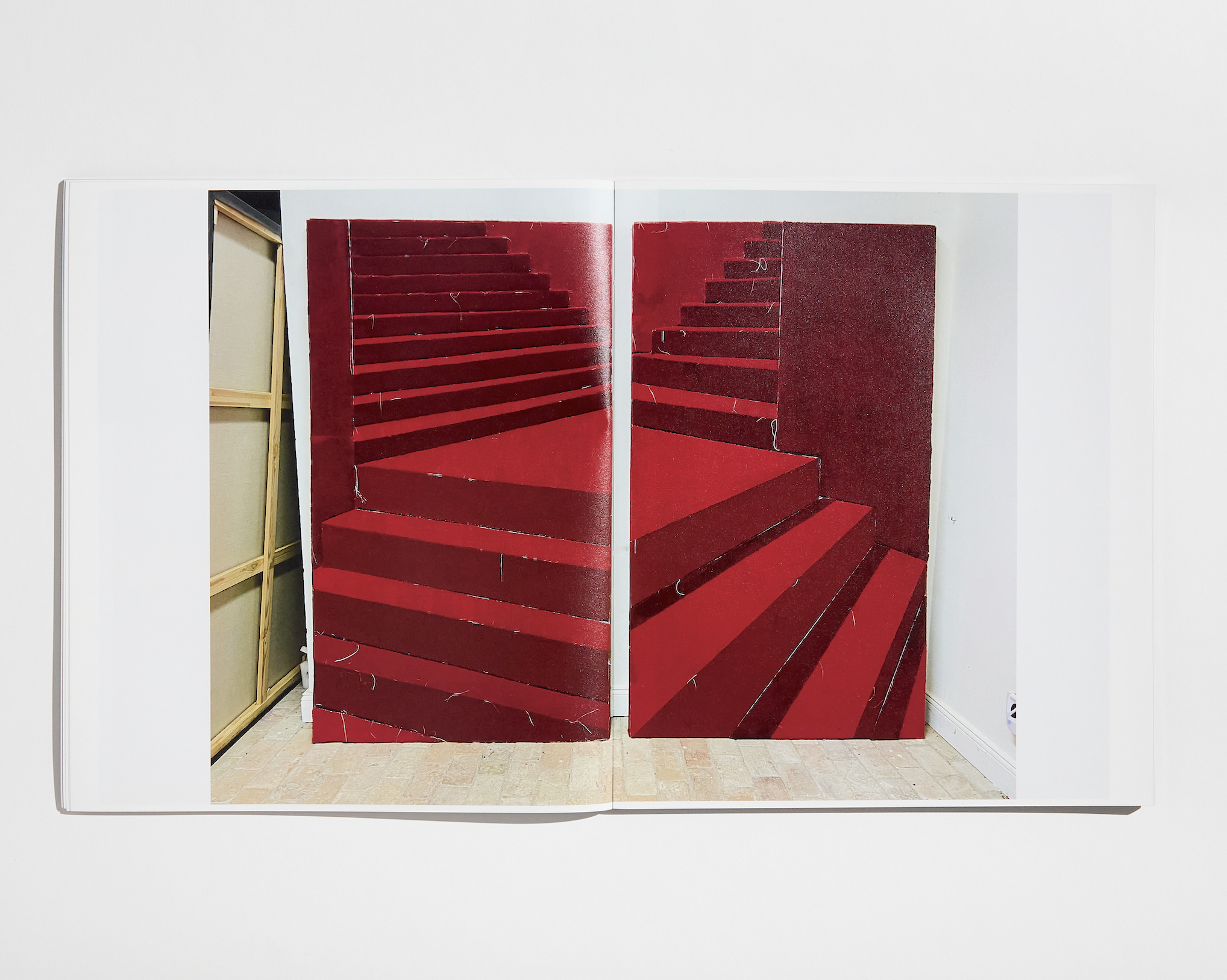
Martin Margiela, ‘Red Steps I’, 2018 - ‘Red Steps II’, 2023. Carpet on canvas on wooden frame, 191.5 × 111.5cm. Martin Margiela, All images © Martin Margiela. All artworks with the courtesy of the artist and Gallery Bernier-Eliades. Image: M-A (A SPACE BETWEEN) issue 4, photo: Harry Nathan.
With thanks to Martin Margiela and Gallery Bernier-Eliades.
138. RUDI MEISEL: A SPACE BETWEEN RHYTHM AND RUPTURE.
Rudi Meisel - Vor meinen Augen. Galerie Bene Taschen, Lindenstraße 19, 50674 - COLOGNE.

Rudi Meisel, Autorast, A3, Königsforst-West, südlich von Köln, BRD 1971. Silver gelatin print. Copyright Rudi Meisel, courtesy Galerie Bene Taschen.
To see an image by Rudi Meisel is to wind the eye up and in to a routine of depiction - caught out as a slice of a life lived in the subconscious.
There is an immediacy of recollection when viewing the photographers' works, an out-of-sequence portfolio of moments caught between evidence and oblivion.
Echoes of art culture ricochet through these multi-layer portraits of lost atmospheres. Personified spaces akin to M.C.Escher's eternal diagrammatic data, as multiple staircases lead the eye back and forth, up and down, as a textile of time - warp of humanity - weft of continuum.
To Giorgio de Chirico’s deserted folly-scapes, where multiple stages and theatres play out simultaneously, as to imagine an audience positioned from every angle. A woman walks with purpose into a cityscape, flanked by oppressive, scorched cathedrals of industry, as to suggest historic events have rendered life impossible, and yet their presence leaches energy as a sense of the impending challenges the figures' determined stride. A bodily shadow cast as a sundial - a subconscious shifting in time, beating on. Meisels' melodic scenarios of daily life echo the tension of Alfred Hitchcock and Edward Hopper, where questioning the rituals of human order risks the unravelling of the very fibre of life.
Meisels' sense of cinematography underscores a visual identity informed by the suspenseful strains of possibility. Inviting the viewer to align the clues within complex visual narratives. Who is the villain and who is the hero? Who are the followers and leaders? The works challenge our own positions and realisations of time and chronology, of acceptance and resistance.
Framed by the architecture of urban control, Meisel meets us at a crossroads - where we face a pause in action, where our conscious states rupture, and a tethering to instinct is exposed. An eyeline which rests on a horizon or foreground, on the hope of the next or the acceptance of the never.
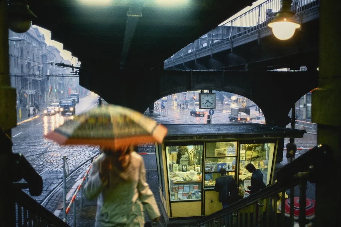
Rudi Meisel, Schönhauser Allee, Dimitroffstraße (nach 1990 Danziger Straße), Prenzlauer Berg, Berlin, DDR, 1984, Chromogenic print. Copyright Rudi Meisel, courtesy Galerie Bene Taschen.
Rudi Meisel - Vor meinen Augen,Galerie Bene Taschen, Lindenstraße 19, 50674 Cologne. Until 16 May 2026.
With thanks to Nadine Dinter.
137. MAI MURAGUCHI: A SPACE BETWEEN ENQUIRY AND RESISTANCE.
Bamboo Progettazione? — Tsung-Yeh Arts and Cultural Center, Madou, Tainan - TAIWAN.
Mai Muraguchi, ‘HELLO, MY EGG NO.1’, 2025. Image courtesy of the artist.
‘My practice attempts to visualise the violence that arises within a community. In such a community, expressing one's opinion may be suppressed by unconscious pressure, or speaking out may destabilise one's position. Under such conditions, silence is not merely a passive choice, but almost the only remaining form of action.’ M.M.
Please can you introduce work made for Bamboo Progettazione?
この作品は、揺れ続ける大型の竹の立体インスタレーションです。構造体は自立しながらも、常にわずかな不安定さを孕み、「起き上がりこぼし」のように外部からの力に応答して反復的に動き続けます。その運動は、均衡が保たれているように見える状態の内部に潜む緊張を可視化します。
本作は、台湾の Tainan Bamboo Society に所属する竹職人との協働によって制作されました。キュレーターの Mankit Auyeung の構想のもと、Enzo Mari が1974年に発表したマニフェスト『Autoprogettazione?』を、台湾の竹工芸という素材と技術を通して再考し、「二重の作者性」という関係性のモデルを提示する試みとして生まれました。そこでは、デザインの意図と職人の身体的知識が交差し、単一の主体では成立しない構造が立ち上がります。
私は制作を始める際、自身の経験や感覚の共通点を出発点とします。Mari が「作ること」を通して問いかけたのは、ある立場や形式を正しいものとして安心してしまう状態そのものへの批評だったのではないかと考えました。この作品もまた、制度や共同体が本当に「安全な空間」として機能しているのか、それとも単に形態として維持されているにすぎないのかを問いかけています。
外側の構造が保たれていることと、内部が守られていることは同義ではありません。作品は壁への衝突や、複数の鑑賞者が異なる方向から同時に力を加えることによって大きく揺さぶられます。そのとき内部に蓄えられていた羽は、籠の隙間から外部へと散乱していきます。ここで露わになるのは構造の強度ではなく、「何がどのような条件のもとで守られているのか」という問いです。
竹の構造体は倒れることなく運動を続けます。しかしその反復のなかで、内部に保たれていたものは外部環境へと曝され、徐々に、あるいは一瞬で失われていきます。観客の身体的な介入を通して、このインスタレーションは心理的・社会的な安全性がいかに脆弱な均衡の上に成立しているのかを示します。それは、圧力に耐え続ける構造の内部で、最初に守られなくなるものは何かを問いかける装置でもあります。
This work is a large, continuously swaying, three-dimensional bamboo installation. While the structure is self-supporting, it constantly harbors a slight instability, moving repeatedly in response to external forces like a roly-poly toy. This movement visualises the tension lurking within a seemingly balanced state.
This work was created in collaboration with bamboo artisans belonging to the Tainan Bamboo Society in Taiwan. Under the conception of curator Mankit Auyeung, it re-examines Enzo Mari's 1974 manifesto, "Autoprogettazione?", through the lens of Taiwanese bamboo craftsmanship, attempting to present a model of a "dual authorship" relationship. In this work, the design intent and the artisan's physical knowledge intersect, resulting in a structure that cannot exist through a single subject.
When I begin creating, I start with commonalities in my own experiences and sensibilities. I believe that what Mari questioned through "making" was a critique of the very state of comfort we feel when we accept a certain position or form as correct. This work, too, questions whether institutions and communities truly function as "safe spaces," or whether they are merely maintained as forms.
The preservation of the external structure is not synonymous with the protection of the interior. The work is shaken violently by collisions with the wall and by multiple viewers applying force from different directions simultaneously. At that moment, the feathers stored inside scatter out through the gaps in the cage. What is revealed here is not the strength of the structure, but the question of "what is being protected and under what conditions?"
The bamboo structure continues to move without collapsing. However, in the course of this repetition, what was preserved within is exposed to the external environment and lost gradually, or even instantaneously. Through the physical intervention of the audience, this installation demonstrates how precarious the balance of psychological and social safety is. It is also a device that asks what is the first thing to be lost within a structure that continues to withstand pressure.
You appear to explore a specific position of contradiction within your practice, to pivot between enquiry and resistance, an urgency to be seen and a specific sense of pulling back. Works which invite collaboration from the public seem to push this point, please can you discuss your position as an artist within what you have made and what the works tell you?
私の実践はしばしば、身体や社会的な振る舞いを形づくる構造を理解しようとする衝動と、そこから距離を取ろうとする抵抗のあいだを揺れ動いています。私にとって「見られること」は、存在を認識されるために必要であると同時に、曝露や統制の危険を伴うものでもあります。私は、共同体の中で無意識の抑圧が働き、目立つことや自分の意見を強く表明することが好ましくないとされる文化的な環境の中で育ってきました。そのような状況では、可視的になることは単なる自己表現ではなく、周囲からの批判や非難を引き受ける行為にもなり得ます。
こうした経験は、社会の構造を理解しようとする探究の姿勢と、そこに完全には同調しない抵抗の感覚の両方を私の中に生み出してきました。私の作品は、そのどちらかの立場を選び取るのではなく、そのあいだに生じ続ける緊張や揺らぎの状態そのものを提示しようとする試みだといえると思います。
観客の参加を促す作品は、単に作品を開くための方法ではありません。むしろ、人と人との関係が常に交渉され続けている状態を可視化する試みだと考えています。参加という行為は緊張を解消するのではなく、むしろその場に潜んでいる視線や力関係を浮かび上がらせることがあります。観客は見る側であると同時に見られる側にもなり、触れることや選択することを通して、自らの立場を意識することになります。
制作の過程で私は、作品から試されているように感じることがあります。どこまで自分を差し出すのか、なにを守ろうとしているのか、そしてどのように沈黙を破るのか。
このように、探究と抵抗のあいだを揺れ動く状態は、解決すべき矛盾ではなく、私が身を置いている状況のようなものです。
My practice often fluctuates between the urge to understand the structures that shape our bodies and social behaviours, and the resistance to distance ourselves from them. For me, "being seen" is both necessary for my existence to be recognised and carries the risk of exposure and control. I grew up in a cultural environment where unconscious repression was at work within the community, and standing out or strongly expressing one's opinions was considered undesirable. In such a situation, becoming visible can be not merely self-expression, but also an act of accepting criticism and condemnation from those around you.
These experiences have given rise to both a desire to explore and understand the structures of society, and a sense of resistance that does not fully conform to them. I believe my work is an attempt to present the state of tension and fluctuation that constantly arises between these two positions, rather than choosing one over the other.
Works that encourage audience participation are not simply a way to open up the artwork. Rather, I see them as an attempt to visualise the state in which relationships between people are constantly being negotiated. The act of participation doesn't relieve tension; rather, it can bring to light the gazes and power dynamics lurking within the space. The audience becomes both the observer and the observed, and through touching and making choices, they become aware of their own position.
During the creative process, I sometimes feel as if I'm being tested by the artwork itself. How much of myself will I offer? What am I trying to protect? And how will I break the silence?
This state of wavering between exploration and resistance isn't a contradiction to be resolved, but rather a reflection of the situation I find myself in.
Viewing certain works, there is a repeated sense of holding breath, a sense of anticipation, as to be confronted and to witness an event. Do you feel a sense of catharsis from the creation of your works?
私の作品から、息を止めているような緊張感を感じ取っていただけたことをとても嬉しく思います。それはおそらく、私自身がこれまでに経験してきた感覚が、作品を通して現れているからだと思います。
私の実践は、ある共同体の中で生じる暴力性を可視化しようとするものです。そこでは、自分の意見を表明することが無意識の圧力によって抑えられていたり、発言することで自身の立場が不安定になる状況が生まれることがあります。そのような条件のもとでは、沈黙は単なる消極的な選択ではなく、ほとんど唯一残された行為の形となります。
結果として、当事者でありながらも状況の変化をただ見続けることしかできない状態が生まれます。私はこのような「関わりながらも介入できない感覚」や、「出来事の内部にいながら外側に立たされるような状態」に強い関心を持っています。
制作がカタルシスかと問われると、私の場合、それは必ずしも感情の解放ではありません。むしろ制作の過程は、緊張や不安定さを消化するためのものではなく、それらがどのように身体や空間の中に持続しているのかを観察し、形にしていく行為に近いと感じています。作品を作ることで何かが終わるのではなく、むしろ別の問いや感覚が新たに生まれてくることの方が多いのです。
その意味で、私にとって制作は癒しや浄化というよりも、まだ言葉になっていない状態や、解決されていない力の関係を可視化し続けるためのプロセスだと言えるかもしれません。作品の中に保たれている緊張は、私自身の内側にあるものでもあり、同時に社会や他者との関係の中で共有されるものでもあると感じています。
I am very pleased that you felt a taking-of-breath tension in my work. This is probably because the feelings I have experienced myself are reflected in my work.
My practice attempts to visualise the violence that arises within a community. In such a community, expressing one's opinion may be suppressed by unconscious pressure, or speaking out may destabilise one's position. Under such conditions, silence is not merely a passive choice, but almost the only remaining form of action.
As a result, a state is created where one, despite being a participant, can only continue to observe the changing situation. I have a strong interest in this "feeling of being involved but unable to intervene," and "being inside an event while standing on the outside."
When asked if my creative process is cathartic, I would say that for me, it's not necessarily about the release of emotions. Rather, I feel that the creative process is not about digesting tension or instability, but rather about observing how those feelings persist within my body and space, and then giving them form. Creating a piece doesn't bring something to an end; rather, it often gives rise to new questions and feelings.
In that sense, for me, creation is less about healing or purification, and more about continuously visualising states that haven't yet been put into words, and unresolved power dynamics. I feel that the tension preserved within my work is both something within myself and something shared within my relationships with society and others.
The sense of particles within your work really fascinates me, tiny bubbles, sand grains, the works made with cosmetics. Please can you contemplate the sense of particles within your practice?
「粒子」という視点から私の作品を捉えていただいたことは、とても興味深く感じました。正直に言うと、これまで自分の実践をそのような視点で意識的に考えてきたわけではありません。私が一貫して関心を持ってきたのは、無意識の暴力性、そして緊張が保たれている状態や、不安定な均衡の中で内部に留められていたものが外へと漏れ出してしまうような瞬間です。
ただ、あらためて振り返ってみると、砂や粉、ガラスの中の小さな気泡、あるいは化粧品のような微細な素材が作品の中に繰り返し現れているのは事実だと思います。それは「粒子」という概念を意識して選んでいたというよりも、自分が扱いたい感覚や状況に近づこうとする過程の中で、結果的にそうした素材に引き寄せられていたのかもしれません。
例えば、砂や粉は、触れたり動かされたりすることで容易に拡散し、境界を曖昧にします。粒子はそれ自体が非常に小さく、単独では脆く見える存在ですが、同時に集まることで環境や身体、社会的な表面を形づくる力を持っています。その両義的な性質に強く惹かれているのかもしれません。
I found it very interesting that you viewed my work from the perspective of "particles." To be honest, I haven't consciously considered my practice from that perspective until now. My consistent interest has been in unconscious violence, states of tension, and moments when things that were contained within an unstable equilibrium leak out.
However, looking back, it's true that sand, powder, tiny bubbles in glass, or microscopic materials like cosmetics repeatedly appear in my work. Rather than consciously choosing these materials with the concept of "particles" in mind, it might be that I was drawn to them as a result of trying to approach the sensations and situations I wanted to address.
For example, sand and powder easily disperse when touched or moved, blurring boundaries. Particles themselves are extremely small and appear fragile on their own, but at the same time, when they gather together, they have the power to shape the environment, the body, and social surfaces. Perhaps I am strongly drawn to this ambiguous nature.
I appreciate that the last few years have been an intense period of learning for you, please can you identify the pivotal moments within this time?
この数年間は、私にとってとても重要な時期だったと感じています。もともと私は日本で長くデザインの仕事に携わっており、アートに関しては独学で勉強してきました。日本の美術館で目にする展示は、工芸作品や近代西洋絵画が中心となることが多く、美術の受容のあり方にはある種の偏りがあるようにも感じていました。そのような環境から離れ、ロンドンに拠点を移し、日常的に数多くのアートに触れられる環境になったことが最初の大きな転機だったと思います。
特にロンドンでの経験は、現在の実践の基盤を形づくる重要な時間でした。自身の身体的な記憶や社会的な経験を出発点にしながら、自分が置かれてきた状況や、無意識の暴力性といったテーマに向き合うことで、関心の輪郭が徐々に明確になっていきました。
また、文化的に同質性の高い環境の中で育ってきた自分が、多様性に満ちた環境でさまざまな背景を持つ人々と出会い、交流する機会を得たことも大きな影響を与えたと感じています。それは、自分でも意識していなかった前提や価値観に気づき、自分に影響を与えてきた社会構造をあらためて問い直すきっかけとなりました。それまで独学で勉強してきたことが、ここでの経験を経て点が線に繋がっていったように感じています。
I feel that these past few years have been a very important period for me. Originally, I had worked in design in Japan for a long time, and I had studied art on my own. The exhibitions I saw in Japanese museums often focused on crafts and modern Western paintings, and I felt that there was a certain bias in how art was received. Leaving that environment and moving to London, where I was able to be exposed to a wide variety of art on a daily basis, was the first major turning point for me.My experience in London, in particular, was a crucial time in shaping the foundation of my current practice. Starting from my own physical and social memories, confronting themes such as the circumstances I've been in and unconscious violence gradually clarified the contours of my interests.
Furthermore, having grown up in a culturally homogeneous environment, having the opportunity to meet and interact with people from diverse backgrounds in a highly diverse environment had a significant impact. It made me aware of assumptions and values I hadn't consciously considered, and prompted me to re-examine the social structures that had influenced me. I feel as though the things I had studied independently up to that point finally connected through these experiences.Bamboo Progettazione? — Until April 26, 2026 at Tsung-Yeh Arts and Cultural Center, Madou, Tainan, Taiwan.
136. CHIHARU SHIOTA: A SPACE BETWEEN LINE AND LIFE.
Chiharu Shiota: Threads of Life, The Hayward Gallery - LONDON.

Installation view of Chiharu Shiota_ Threads of Life. Threads of Life (2026). Photo_ Mark Blower. Courtesy of The Hayward Gallery. ∏ DACS, London, 2026 and Chiharu Shiota.(1)
M-A: I was fascinated to witness your works as somehow morphing between states, between an installation and a drawing - how have you come to understand the medium of your installations, and has your relationship with thread changed over time?
C.S: I always wanted to be a painter, but when I was in art school I felt stuck. I felt that everything I created had already been made before. It had no feeling, it was just colour on a canvas.
Only later, when I started using thread, I felt that I could put meaning into the material. At the same time, it still felt like I was painting. The single line in the installation is like a line in a painting. I feel as if I am drawing in the air.
I need to create the artwork in the museum. I cannot make the work in the studio. The installation is like a drawing, it changes while I am making it and depends on where I am making it. I continue creating lines until people can no longer follow a single line with their eyes.
Chiharu Shiota is a contributing artist to M-A (A SPACE BETWEEN) issue 5, The complete interview will be published within the issue, which will be presented in the autumn of 2026.

Installation view of Chiharu Shiota_ Threads of Life. During Sleep (2026) Photo_ Mark Blower. Courtesy of The Hayward Gallery. ∏ DACS, London, 2026 and Chiharu Shiota.
Chiharu Shiota: Threads of Life, The Hayward Gallery - LONDON. Until 3 May, 2026.
With thanks to Megan Edwards, Rosalie Pfleger and Dr. Kyung Hwa Shon.
135. MARISA GONZALEZ: A SPACE BETWEEN COHESION AND VIOLENCE.
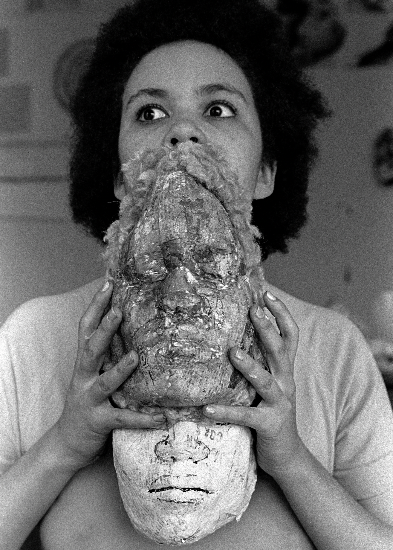
Marisa Gonzalez, Lizz Williams y sus máscaras 1974-5. Image courtesy of the artist. © Marisa Gonzalez.
‘…My quest involves subverting technological means and the standard messages they usually convey, putting them at the service of those silenced voices.’ M.G.
Over fifty years have passed since Marisa Gonzalez made a series of portraits of her classmate Lizz Williams, while a student on a study trip to Washington D.C. from her hometown in Spain. The series was re-presented in Paris in 2025 - a time capsule as iterations of thoughts - caught and pressed into office supply copy and acetate sheets - their surfaces dimpled with provenance, their focus - searing with purpose.
Please can you introduce the body of work presented at Paris Photo.
La Descarga, 1974-1975
Después de leer una noticia en un periódico de Washington sobre la violencia y la represión contra las mujeres en las cárceles chilenas, inicié un proyecto en el que colaboraron compañeras y profesoras de la Corcoran School of Art, a quienes propuse escenificar el impacto de la violencia sobre sus cuerpos, creando así una serie fotográfica de base performativa, práctica habitual en los grupos de concienciación feminista bajo el lema “lo personal es político”. Entre las participantes se encontraba mi profesora, la artista Mary Beth Edelson, y mi compañera de estudios Karen Sommerville. Con Karen, en la Corcoran Gallery realicé mi primer vídeo performance titulado Violencia, donde quise reflejar la represión y tortura política mediante secuencias de “action painting” en una pared de la sala.
Posteriormente, trabajé sobre estas sesiones fotográficas montándolas en acetatos de alto contraste procesados con la máquina Thermofax, y fui creando series modulares, que se mostraron en el Corcoran DuPont Center de Washington D.C en 1975, y también en New York en Cayman Gallery 1977, y en el 78, en el Museo de Arte contemporáneo de Madrid MEAC, entre otros.
The Download, 1974-1975
After reading a news article in a Washington newspaper about the violence and repression against women in Chilean prisons, I began a project in which colleagues and professors from the Corcoran School of Art collaborated. I proposed that they stage the impact of violence on their bodies, thus creating a performative photographic series, a common practice in feminist consciousness - raising groups under the motto "the personal is political." Among the participants were my professor, the artist Mary Beth Edelson, and my classmate Karen Sommerville. With Karen at the Corcoran Gallery, I created my first video performance titled: ‘Violence’, where I wanted to reflect political repression and torture through sequences of "action painting", presented on a gallery wall.
Subsequently, I worked on these photographic sessions by mounting them on high-contrast acetates processed with a Thermofax machine, and I created a modular series, which were shown at the Corcoran DuPont Center in Washington D.C. in 1975, and also in New York at the Cayman Gallery in 1977, and in 1978, at the Museum of Contemporary Art of Madrid MEAC, among others.
There is a sense that the work seen in Paris is somehow not set… somehow unresolved, as if still hot from being processed, and yet because of the consistency of what was shown, the works felt to be interconnected, as a cohesion of elements. Please can you discuss the sense of how you work and how you know when a work is realised.
La interconexión y cohesión entre elementos que percibes en mi obra se da, en este caso, pienso yo, por el tema que me preocupaba en ese momento y por mi intención de aportar obras que causaran un impacto en los espectadores, que los moviera a tomar conciencia de esa realidad y de tantas otras similares que siguen aconteciendo en el mundo a lo largo de los tiempos, lamentablemente.
¿Cómo sé cuándo está lista una obra? Pues, cada caso es diferente. Son cuestiones estéticas y de contenido, ese equilibrio, el que me lleva a decidir que una obra se puede mostrar como “terminada”, en un sentido. Pero nunca, en mi caso, eso implica un final, porque mis obras son generativas. Es un proceso que siempre sigue. Siempre sé cómo empieza, pero durante el desarrollo del proceso surgen nuevas vías a seguir. Sé cómo voy a empezar, pero nunca puedo prever cómo va a terminar.
The interconnection and cohesion between elements that you perceive in my work, in this case, I think, stems from the theme that concerned me at the time and my intention to create works that would have an impact on viewers, moving them to become aware of that reality and so many other similar ones that, unfortunately, continue to occur throughout the world.
How do I know when a work is finished? Well, each case is different. It's a matter of aesthetics and content, that balance, that leads me to decide that a work can be shown as "finished," in a sense. But in my case, that never implies an end, because my works are generative. It's a process that always continues. I always know how it begins, but during the development of the process, new paths emerge. I know how I'm going to start, but I can never foresee how it will end.
The sense of subversion feels very pronounced within your work, the use of media - sense of the ancient, the primal and also a certain feeling of privacy which feels violent. Please can you expand on the sense of instinct and subversion within your work.
Qué hermosa y sensible lectura de estas obras. Pienso que se debe a que yo he querido expresar emociones íntimas pero universales, emociones que no se limitan al hecho en sí que me movió en cada caso particular, sino a cuestiones con las que nos hemos tenido que enfrentar a través de los tiempos y que, por más que haya avances tecnológicos importantes, siguen sucediendo. Mi búsqueda tiene que ver con subvertir esos medios tecnológicos y los mensajes estándar que suelen comunicar para ponerlos al servicio de esas voces silenciadas.
What a beautiful and sensitive reading of these works. I think because I wanted to express intimate yet universal emotions. Emotions that aren't limited to the specific event that moved me in each particular case, but rather to issues we've had to confront throughout history and that, despite significant technological advances, continue to arise. My quest involves subverting these technological means and the standard messages they usually convey, putting them at the service of those silenced voices.
I am fascinated by your approach to making the work - the use of different machines, such as photocopies, which could seem impersonal, and yet your approach is very emotive…
Justamente en eso está la subversión, en utilizar la máquina para transmitir mensajes más humanos. Las máquinas son las herramientas que nos permiten crear a partir de un lenguaje contemporáneo. Me acerco a ellas con la intención de explorar su potencial creativo. Cada una deja una impronta diferente en las obras y esa peculiaridad que las diferencia, o que incluso constituye muchas veces sus propios límites, es lo que me interesa explorar y desarrollar. Hay que ir conociendo bien cada máquina para saber lo que te puede ofrecer y no pedirle aquello que no te puede dar.
That's precisely where the subversion lies: in using the machine to transmit more human messages. Machines are the tools that allow us to create using a contemporary language. I approach them with the intention of exploring their creative potential. Each one leaves a different imprint on the works, and that peculiarity that differentiates them, or that often even constitutes their own limitations, is what interests me. You have to get to know each machine well to understand what it can offer and not ask it for what it cannot give.
The presentation of works made in the 1970s, seen at Paris Photo were fascinating. I am very interested by the sense of an active archive, where works are still in use, revisited with an evolved sense of context, please can you discuss what the archive means to you and how you use it.
Para mí el archivo es algo que está en potencia, algo orgánico. A veces, lo revisito con una intención específica; otras, porque algo olvidado reaparece y me abre nuevas vías, porque al redescubrirlo constato su potencial vigencia.
For me, the archive is something that exists in potential, something organic. Sometimes, I revisit it with a specific intention; other times, because something forgotten reappears and opens new avenues for me, because in rediscovering it, I confirm its potential relevance.
134. TAKAY: A SPACE BETWEEN SUSPENDING AND FALLING.
‘Tesseract’, Akio Nagasawa Gallery, Paris Photo.
©︎ TAKAY courtesy of Akio Nagasawa Gallery.
‘I photographed pole dancers — subjects that appear almost suspended in mid air from multiple angles, and experimented with distortion, layering, and collage.’ TAKAY.
Please can you introduce your series of images presented at Photo Paris?
These works are from the Cube series within my project titled “Tesseract,” which I presented in 2025.
When I saw your series at Photo Paris, I was really drawn to the atmosphere, the sense of ambiguity within the forms and within the media... a visual collage, as the shadows float over objects combined with silhouettes of figures. Please can you discuss the atmosphere of this series?
These works are part of a series titled “Tesseract,” in which the regular 16-cell (octachoron) is experimentally expressed through the human body. Before arriving at this cube series, I produced works using various experimental approaches. I photographed pole dancers—subjects that appear almost suspended in mid air from multiple angles, and experimented with distortion, layering, and collage. All of these explorations were compiled into a single photobook, which I published last year.
What do the different cities that you work in teach you?
I have lived in London in my twenties, New York in my mid-thirties, and Tokyo in my late forties. Perhaps partly due to age, but in London, I was deeply influenced by 1990s UK culture and studied edgy fashion photography and visual culture. In New York, I learned the business side of working in the fashion photography industry. In Tokyo, I now apply these experiences to balance both creative practice and business.
What does black and white mean to you?
For me, black-and-white photography was the first form of photography I learned. I believe that by reducing a subject to tonal gradations of white, gray, and black, monochrome photography allows the subject to be expressed more powerfully and with greater emphasis.
What do you feel your work as a whole represents?
I don’t really know. Perhaps that is why I try to express something through photography. I am never truly satisfied.
©︎ TAKAY courtesy of Akio Nagasawa Gallery.
With thanks to Joomin Oh, Akio Nagasawa Gallery.
133. OISHI ROY DUTTA: A SPACE BETWEEN INTERSECTION AND INTERROGATION.
Oishi Roy Dutta, “ROW”, Tate Britain - LONDON.
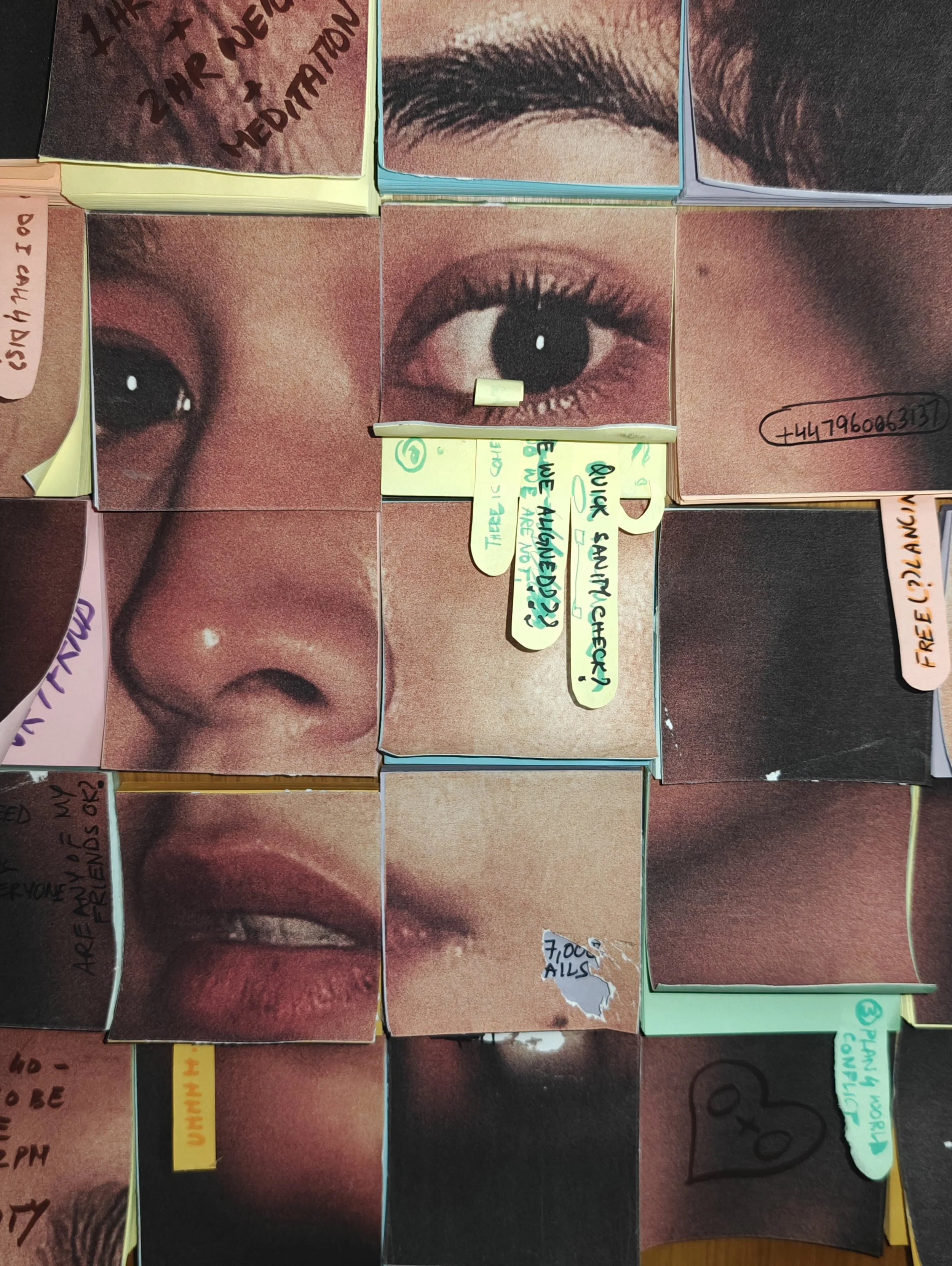
Oishi Roy Dutta, “Sanity Check”, 2026, Mixed Media. Image courtesy of the artist.
‘I’m in a post-dream phase of my life. Where I can't just be an idealistic dreamer, it's time I bring all this ambition and experience into action. As a result I am pulled in a million directions, all recorded on post it notes…’ O.R.D.
Collage and weaving are techniques which you return to within your practice, what do these methods mean for you?
It is all essentially a method I use to represent our multidimensional, interwoven lives. There are versions of us, physical, digital, public and private that kind of layer and weave through the fabric of our lives. Collage and weaving a very literal representation of that. It also allows me to expose the seams of our organic limits being pushed, expanded and even torn by the digital. The effort and time that the process takes becomes a part of each piece, as all the objects cut and stuck feel like a version of ownership, satiating at least a part of my desire to consume. It allows me to create moments of intersection and interrogation that I often respond to with humour.
You recently presented a series of works which were projected into a specific space, please can you introduce this work?
Yes, the work being talked about is my short film titled “ROW” which was recently screened at the Tate Britain alongside the Lee Miller curation. The work discusses the loss of identity and selfhood under a fervent collective. Anchored by the presence of red fabric, an emblem of power, sacrifice, rage, and divine authority, the film follows the relationship of a group as they are slowly consumed by the ecstatic force of communal ritual. What begins as devotion unravels into disorientation, as the overwhelming unity of the group erodes not only personal identity but the very foundations of moral judgment. It was important that religion wasn’t the only institution that is referred to but also, political and other groups that carry social currency, and have the ability to sway people with propaganda.
Please can you expand upon why you use certain colours within your practice?
I think I have always been a little fascinated with red. More so over the last year. Silver is the close second contender in its share of obsession. It is just such an alluring colour. It represents the unavoidable to me. It represents the need for consumption, love, hate, danger, rage. It is a representation of intensity. It's seen in the body and being, when you close your eyes. It is simply a representation of a version of me that I cannot ignore and should not be. As more often than not, it signified importance and a need to divert attention.
Symbolism of object and organic matter reappears within your practice, such as tomatoes - please can you expand upon why you choose these items?
It's very simple. I really love tomatoes. I love to eat them, they look cool, and they are good for you. It's my way of bringing in some ridicule and humour to my work that represents the very ridiculous things we focus on and the absurdity of modern lives.
The memo pad portrait is fascinating and appears to combine photography and performance - please can you expand upon this work?
The work is titled “Sanity check” a title that came up from my absolute repulsion to the phrase, when someone brought it up during a work meeting. Sanity, reduced to a quick and simple “check” seemed very descriptive of our time. I’m in a post-dream phase of my life. Where I can't just be an idealistic dreamer, it's time I bring all this ambition and experience into action. As a result I am pulled in a million directions, all recorded on post it notes, these ridiculous lists of 10 - day long tasks “to-dos” to be somehow managed in one day. It takes an incredible mental load to keep going, often checking off a task takes away little parts of me, eroding the surface bit by bit. Sanity check is the cost of a dream, where identity is commodified and each action needs to have a monetary profit.
132. GEORGE CONDO: A SPACE BETWEEN ARTIFICIAL AND REALISM.
George Condo. Musée d’Art Moderne de Paris - PARIS
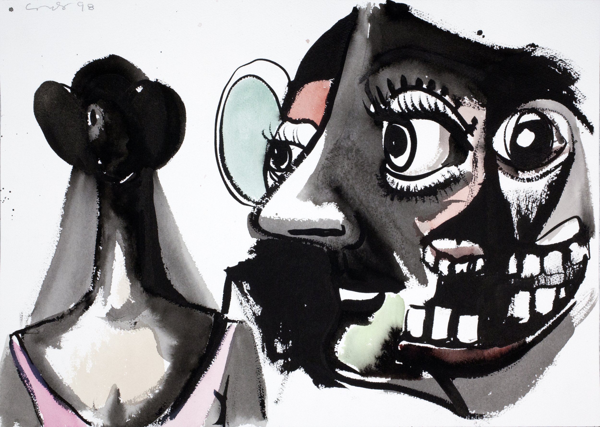
George Condo, Untitled, 1998, Collection de l’artiste. Photo: Courtesy Studio Condo © ADAGP, Paris, 2025
M-A: ‘George Condo’s mass of hybrid paintings, overwhelm as to be tainted with the stains of consequence, both ancient and future. Irritate the very essence of now.’
Paintings as drawings and drawings and paintings - his particular jarring of image - make for an active riot of fetishised depictions of violated bodies.
Akin to Philip Guston - whose tremulous paintings quiver with frenzied trauma - Condo is near carnal in comparison - obsessive of flesh - his primal depictions arc through emotional intrigue, at times wanton and macabre, at others surprisingly tender and yet consistently volatile, in composition and nuance.
As a tide, we return to the condition of man, the fundamental frustrations and release - as within the states of consciousness - we see the wrestling and resolve of an artist aligned to releasing an instinct to line - that is both mysterious in nature and rehearsed in nurture - asking the question; what is George Condo unearthing within works which seemly fixate on a surface, salacious to shock.
His expanded canvases have no central point of focus - a pictorial language of self-proclaimed 'artificial realism' - challenge notions of morality and freedom - as to watch stilled cartoon content caught between channels - outlawed as amusement - an inferno of confusion - as his hacked and torn collages - form plateaus - as the debris of an abattoir floor, familiar in anatomical form yet fractured in proposal - works appear as undulations of tone - as to be seeped in fluids of life no longer active yet fermented in genetic information.
As carved into canvas - a sequence of works further resist categorisation - part notation, part visual score, he further toys with definition - antagonising historic positions. Bleached canvas drawings appear gleaming - their inscribed surfaces pressed with information as if platinum sheets. Layer upon layer of a filigree of some ancient inscription - expose a crawling surface of the grimacing - as to scan the inky pages of newsprint - subconsciously seeking - chance forms within the spaces of white - a scrawling codex of rhythms running backwards and forth - forming a patina to mar - to exhaust into continuum.
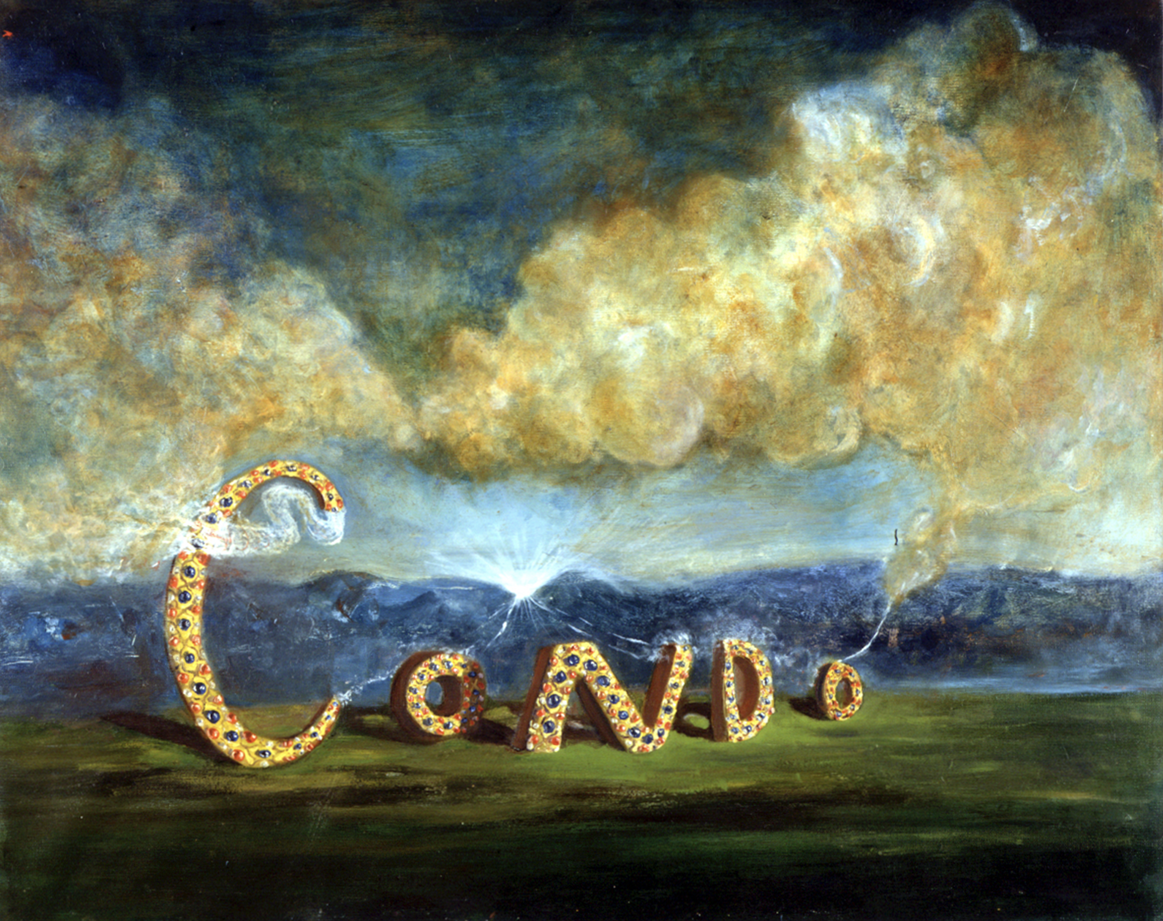
George Condo, The Cloud Maker 1984, Collection de l’artiste, image courtesy Studio Condo © ADAGP, Paris, 2025.
GEORGE CONDO Musée d’Art Moderne de Paris - Until 15th February 2026.
With Thanks to Eléonore Allier
131. PAUL MPAGI SEPUYA: A SPACE BETWEEN WITHIN AND APART.
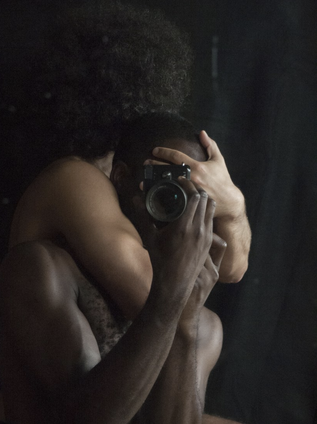
Paul Mpagi Sepuya, Darkroom Mirror (_2070386), 2017, 24 x 32 inches. Courtesy of the artist, © Paul Mpagi Sepuya.
‘…the mirror is overall a device that creates a boundary between subjects or objects and viewer. They draw the line at what is within, and what is apart. What I like about this is what’s left is desire as a method of navigating this boundary.’
Paul Mpagi Sepuya.
To see a work by Paul Mpagi Sepuya is to enter an atmosphere which appears conscious of our gaze.
Billboard in scale, his life-sized figures, often staged within swaths of curtains, evoke a protective set - a space of improvisation, careful to record the pivotal in the play.
As to be conscious of a position held by others and to embody a tender curiosity which exists on the very edge of instinct.
Seeing your work at Paris Photo was revelatory. A monumental image: two figures gently holding each other, the asymmetry of composition, the sense of a stage within a space which seemed poised and yet ambiguous. And the scale - as a 17th century European oil painting...
It was extraordinary to witness within the Grand Palais, a space filled with activity and noise, and when I saw your work: Sudden silence.
Thank you, it’s always nice to hear how people encounter my work for the first time.
Twenty years into this, and about a decade into the work that really came to be known to wider audiences, it’s helpful and good to know how what to me feels so familiar does appear to new eyes. The title of that work is Daylight Studio (0X5A4577), from 2022. It’s from a series from Spring 2021 through roughly Fall 2023 called Daylight Studio / Dark Room Studio, which was a follow-up to my 2016 - 2021 project Dark Room, that explored play and intimacy within formal construction and deconstruction of my studio and the space of the photographs through mirrors and other elements. This new series was sparked by moving studio spaces, and in the process of settling in, looking at historic images of Western European and American photography studios.
I began noting at first, and gathering objects - antiques, postmodern and contemporary pieces - to inhabit a kind of historic but resonant space. I began photographing myself alternating between working or preparing the space and resting, or napping, and then as COVID opened up, inviting friends in. This is a rare photograph made with someone I met that same day. Vonnie asked what I did, I explained this project and he asked to come by and take part. I’ve mostly resisted photographing at-the-time stranger for many reasons, but these pictures really came out thanks to his curiosity and our playfulness.
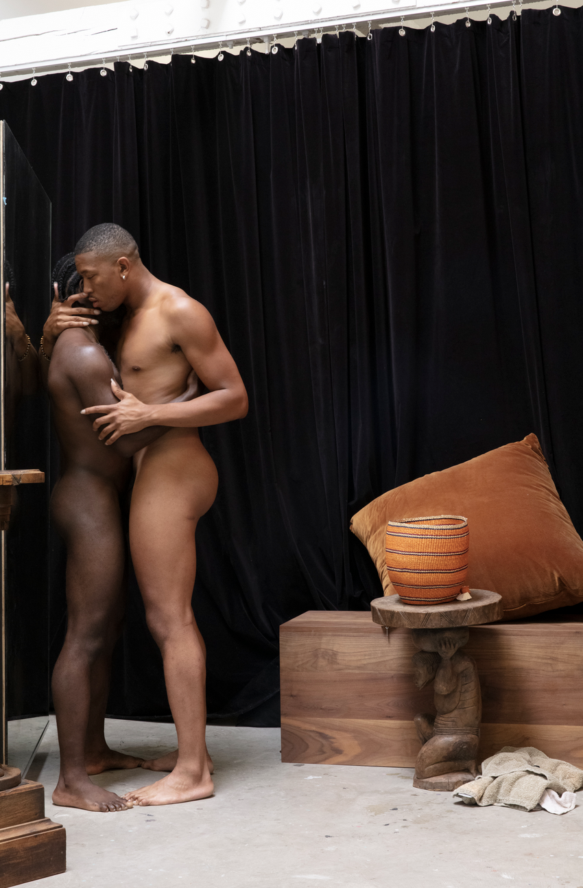
Paul Mpagi Sepuya, Daylight Studio (0X5A4577), 2022, 50 x 75 inches. Courtesy of the artist, © Paul Mpagi Sepuya.
The veiled spaces are really fascinating…
Maybe I’d describe them as nested spaces within the photographs that contain something being looked at, or reflecting what the viewer of the final image cannot see. Every backdrop divides a space into what’s between the material and the wall, and then what’s behind it. I was just curious about that space. But there are very few veiled spaces, except maybe in the “SCREENS” works. There are backdrops that serve as dividers, there are mirrors at angles. There is the camera that obscures a subject’s face with its own reflection.
Observing the images, I was fascinated by the sense of a surface as witness - the occasional smudged fingerprints, the torn tapes - fragments of the temporal... All form a sense of being held and a sense of touch, the focus on hands but spaces which seem to hold time... Will you expand upon how you use space and ideas of space within your practice?
Yes, surfaces have been a major formal and conceptual aspect of the larger DARK ROOM project and the project that followed in Daylight Studio / Dark Room Studio. In many of the pictures, what you are looking at is a photograph made of the surface of a mirror, which includes reflected the camera making the picture. The photographs shown at Paris Photo Voices are all “direct” pictures as in they are not of reflections, but in each, there is a mirror present that provides to the figures their reflection to engage with. What I’m interested in with these is that there is a closed loop, a circuit happening between the subject(s) and their images, that is not visible to the viewer of the final photograph. A hidden intimacy there.
The returning use of reflections feels more of a gesture within your work than a direct object, even when mirrors are utilised. This really interested me, how through movement and observation, you explore a sense of return. A feeling as a echo, which at times feels like a time delay... Please will you contemplate the use of a mirror within your practice?
The use of mirrors began in 2014 with initial studies, a series of photographs and using them as surfaces on which to affix unresolved image material and notations. Creating formal arrangements that would only come together and be photographed through the point perspective of the camera placed on a tripod in front of and facing the mirror. I realized that its surface should not disappear so that its presence could be noticed. It was not meant to create a trick. So I stopped cleaning the surface between photographs and smudges developed. The DARK ROOM project began when I was experimenting with new portraits while using backdrops in my space, and it caught my eye that when reflecting these black and brown fabrics, the otherwise latent smudges and fingerprints came into clear view. This opened up so many metaphors and ways of thinking. But the mirror is overall a device that creates a boundary between subjects or objects and viewer. They draw the line at what is within, and what is apart. What I like about this is what’s left is desire as a method of navigating this boundary. A desire to be in relation, or within, when realizing the space into which the viewer is looking is actually closed off, despite the camera’s reflection seeming to implicate them.
Your work evokes an ongoing exploration with collage and collaged conditions, which enable such an idiosyncratic state of poise. Similarly to an earlier thought about gesture, how do you know when you have reached a point where the work evidences how you feel?
That’s an interesting question, I’m not quite sure what you mean. The original “Studies” from 2014 - 2016 were temporary compositions for the purpose of making photographs that in turn looked like collages. Each was a response to the idea of a portrait of a person or persons close to me. So within them there is a kind of longing, missing, or wanting and desire. In the “DARK ROOM” series Mirror Studies that also were described as collage-like, they work for me in the same way. Later *actual* collages that I began making in 2018 were more about looking at composition. But all works for me have some nested sentimentality. But it’s a funny question because I realize I’ve never considered an evaluation of the work based on wanting the viewer to feel emotionally. Or about communicating anything about that on my end. What I want the viewer to feel is themself in relation to pictures and material that they are outside of, excluded from formally, but implicated in relation by way of their own desire.
Paul Mpagi Sepuya, DARKCLOTH (_2000142), 2016, 24 X 32 inches. Courtesy of the artist, © Paul Mpagi Sepuya.
130. GEORGES SEURAT: A SPACE BETWEEN POPULOUS AND LONE.
Radical Harmony, Helene Kröller-Müller's Neo-Impressionists. National Gallery - LONDON.
Georges Seurat,'D'écho', (Study for Une baignade, Asnières).(Bathers at Asnieres) 1859-9. Conté crayon on paper. Yale University Art Gallery. Published within M-A (A SPACE BETWEEN) issue 4.
Images as visions - cloudy as to wake from a daydream, as pupils constrict into focus. Graphite grazes a surface - evoking impressions of the familiar - silhouetted forms, hazy as to be sculpted by light and air. Seurat informs his studies with information without annotation; his porous approach is gentle as to caress yet evidential as to contribute to a greater whole, made within the continuous evolution of discovery, awe-struck with a sensorial ability to communicate with the very fibre of life.
To contemplate as to be a pixel, a glitch within a system - overwhelmed with mechanised speed. A formed society, collectively concerned, faced the forest away from the factory. To tread within a world seemingly blanketed in snow, so deep as to muffle sound, and dapple an impression within the nature of a newfound page. The micro dot appears as if from the lens of the magnified specimen, of a feathered tuft, as a skin's pore, as to stare as if for the first and last time simultaneously.
Seurat’s loyal thoughts return to values treasured by workers, whose lives are monitored by others, within systems that allocate time, governed by profit. The artist’s depictions of the resting, the unposed, the staring into space - hark back to a nature poised within a pecking order - alert to position and weary of the continuum of labour. His punctum portraits of atmospheres held as a drop on the brink of falling - mediate conditions ahead of definition - they focus on time of day, tides and breath - as a clock face whose hands are removed to reimagine a life which does not tick - rather pulse.
A collective technique, a shared philosophy, articulated and furthered by comrades of painters - exploring the iconography of pointillism - expressed within an undulation of responses. As a musician writes a score - a proposal of sound read in silence, so too do the Neo-Impressionists present works which await reading, translating marks made en masse to encapsulate a gesture.
Paintings further evoke a collective sense of the organic, unfathomable power of the natural world, within the overpainting of frames which appear to shimmer as reflections from a water's surface. Are we looking at an impression of nature, or are we viewing a prayer, a moment held, as a memory.
Seurat's radical sense of reduction appears amorphous as to be hewn from stone, his objects and crowds suggest a sense of searching, scanning for information, so that forms uncloud as architecture, pronounced as structures seemingly familiar yet distant from view. As to return to an ideology which prioritises the fleeting over the fixed. As to harmonise within a collective spirit of visual voices, a choir as opposed to a soloist.
And it is within this idea that denotes Seurat's influence as perpetually modern, his work is shared both with the unnamed souls he depicts and also as a member of the Neo-Impressionists to whom he belongs, collectively believing in furthering the populous than the lone.
‘Young Woman: Study for ‘A Sunday on La Grande Jatte’, 1884-5. Conté crayon on paper, Kröller-Müller Museum, Otterlo, The Netherlands. Acquired with support from the Rembrandt Association.
Radical Harmony, Helene Kröller-Müller's Neo-Impressionists. National Gallery, London. Until 8 February 2026.
With Thanks to Neil Evans.
A series of works by Georges Seurat are published within the 4th issue of M-A (A SPACE BETWEEN), available while stocks last.
129. OLIVIER MILLAGOU: A SPACE BETWEEN PIN AND PARADISE.
Drawing Pin - MAC VAL - Musée d’art contemporain du Val-de-Marne.
Olivier Millagou, Drawing Pin - MAC VAL - Musée d’art contemporain du Val-de-Marne.
‘I chose stars for their countless possible symbolic meanings. They can be geometric figures, celestial bodies, sporting symbols, celebrity symbols, heraldic symbols, religious symbols, as well as being found in the sea… and I also had this desire to draw a starry sky, to offer a simple representation of moments of contemplation. For a time, I tried to depict, in a way, landscapes of a lost paradise.’ O.M.
Please can you introduce the installation on show at MAC VAL?
This is a wall drawing created with gold pins on a black wall. Each drawing in this series has a generic title, Drawing-Pin. This one dates from 2024 and depicts a starry sky.
On viewing the work for the first time, the atmosphere within that space felt hallowed... the remains of something... as a frieze high on a wall, and yet also deeply celebratory - please can you discuss how you decided upon the work's installation?
This drawing is the last in the Drawing-Pins series, and it differs from my previous works because it originated from an invitation by Christoph Wiesner to participate in an exhibition at the Esther Schipper Gallery in Berlin, where all the works were to be displayed on the ceiling. I proposed the idea of a mural, placed high on a wall, with a design that varied without repeating. The method of installation is defined by the material itself: a thumbtack in a wall.
The choice of materials and application really fascinated me... and the sense of permanence and non-permanence... a site-specific installation pinned down, studded as a piece of upholstered furniture, and yet there was a sense of punk somehow, of breaking rules... and yet a feeling of such liberating beauty which felt as art nouveau...
The Drawing-Pins series began with my very first exhibitions.
These drawings arose from several desires: the first was to imagine a way to display drawings using a material I could reuse for multiple exhibitions, and produced in France (for exhibitions within the country, but also produced in other countries to avoid transporting artworks). The second was to respond to an economic and philosophical necessity of creating work without a studio. And the third, finally, was to question that moment in life when we leave behind our childhood constructs to become adults. I was interested in the idea that at some point, the posters displayed on our bedroom walls during our childhood are eventually removed. Symbolically, all that remains are the pins on the walls, becoming points that can be connected, and which can represent a remnant of what these posters may have left on us.
I started with this project by thinking about a work that could occupy a space with small things, in this case, thumbtacks, which, once the exhibition is over, become functional objects again or are reused for the next exhibition, or recycled. There was a real desire to do something with very little, and like the idea of punk, to make do with what you have on hand; in fact, the first drawings were a series of band logos.
The pin feels symbolic, somehow an invisible item which is generally used to pierce a surface in order to present another element, and yet within this work - the pin is central, and yet from a distance the entirety of the stars become something else... they become a whole, made of tiny elements...
You could find several kinds of thumbtacks commercially: some with colored plastic film, others simply made of brass. I opted for the brass version because this material can be recycled indefinitely. It represented a common, simple, and functional object.
The way I found at that time to question the consequences of the climate crisis was to systematically paint all the walls of my exhibitions matte black, thus contrasting the colours of the images I was referencing. I like this contrast, offering something humble alongside something bright, sparkling, and present, mimicking precious materials with modest ones. The idea of using materials that normally serve only as functional elements as central elements also stemmed from the desire to find ways to produce a work of art while limiting the consumption of raw materials and energy.
The motif of a star, historically, is very specific, and yet has become synonymous with magic, festive seasons and fame... a divisive symbol which sometimes evokes much pressure, and within a work made of pins... There seems to be an irresistible connection. What does the star mean for you?
I chose stars for their countless possible symbolic meanings. They can be geometric figures, celestial bodies, sporting symbols, celebrity symbols, heraldic symbols, religious symbols, as well as being found in the sea… and I also had this desire to draw a starry sky, to offer a simple representation of moments of contemplation. For a time, I tried to depict, in a way, landscapes of a lost paradise.
Olivier Millagou, Drawing Pin - MAC VAL - Musée d’art contemporain du Val-de-Marne.
128. FELIX GONZALEZ-TORRES: A SPACE BETWEEN SWEETNESS AND LIFE.
MINIMAL, Bourse de Commerce, Pinault Collection - PARIS.

Felix Gonzalez-Torres, Bourse de Commerce, Pinault Collection. Image: M-A (A SPACE BETWEEN).
'Pieces presented as simple, in plain sight yet weighted with symbolism, coded for those open to appreciate the deep-seated in the seemingly superficial. For a work which sits on a surface of a gallery floor, is also deeply rooted in the subconscious of human survival and stigma.’ M-A
At first glance, what appears to be a momentary shard of light resting on a floor - a reflection from a series of paintings above deceives the eye and is in fact a mass of confectionery.
Sun bleached as an outstretched shore - powdery pale as to be made of countless shells - ground down to form a singular land mass. Still and controlled yet symbolic of a process - volatile and destructive, yet presented as a sparkling mirage.
Ivory - the colour of bleached corals which lose pigment as they die, once fluid and vital, vivid - undulating as a textile, become morbidly brittle and white.
A dry landscape of zen, reinterprets nature as eternal, maintained by shadows of the trusted - mysteriously replenishing a bodies weight - as benign strangers visit with naive intrigue, to collect a souvenir - as a piece of a soul, as to be a canable. No shoots of green spring here only contemplations grown and dissolve as the possibility of thoughts rooted in regret.
A wrapper which loses its original purpose to protect becomes an ephemeral debris - once its contents is consumed.
Pieces presented as simple, in plain sight, yet weighted with symbolism, coded for those open to appreciate the deep-seated in the seemingly superficial. For a work which sits on a surface of a gallery floor, is also deeply rooted in the subconscious of human survival and stigma.
Overwhelming in scale, as a shocking exposure - seen as a mass of countless units in plain sight - confronts a notion of confession - forcing the eye to glaze in order to witness the work as a whole, reduced to a single type - as a verbal narrative distilled to a pertinent concentration. As pointalist dots... a pox, as a virus which coagulates to form a whole - to engule and to be engulfed.
Symptoms read as provenance - tracing back to origin as forms of remembrance - yet are read as unexpected and intriguing. As the exposure of situations which are hidden from view, as shame - brushed under a carpet. Symbolised as candies readily available and yet are demonised as dangerous, yet remain to continue to tantalise as sparkling choices - pre-packaged and light - yet complex and divisive.
Torres' confectionery choice remains a forbidden state of mind, an attitude-evoking knowing metaphor. A medium belonging to memory, even whimsy, a specific campness which evokes retrospection, and it is this awkward combination which supports an overarching taught atmosphere of the unnatural. A mass of glittering, unclaimed prizes as the contents of a piñata, which remain left behind, as if an event removes the opportunity of life.
MINIMAL - Bourse de Commerce, Pinault Collection - Paris, until 26 January 2026.
With thanks: Jessica Seoane.
M-A (A SPACE BETWEEN) contemplation and interview series will return in the spring. Thank you for reading.
127. CHANG LING: A SPACE BETWEEN MEMORY AND PROPHECY.
Don Gallery, Freize London.

If My Hometown - Plantain Garden 假如故乡-芭蕉园, CHANG Ling 常陵, 2025. Oil on canvas 布面油画, 162 × 130.8 cm.
‘Unlike the overt expressiveness often found in Western traditions, this seemingly vanishing way of seeing allows the viewer to quietly dissolve into the work through space and light to become, ever so faintly, part of the indistinct crowd.’ L.C.
Seeing your paintings during Frieze London, I was drawn to your paintings which evoked a very specific depth of energy. Directly evoking a link back to the traditions of scroll paintings… Please can you contemplate the works as a series?
‘If My Hometown’ is a body of work I began in 2024. The abstraction of hometown lies within the collective consciousness of each act of looking back. In this new era of AI, the power to compose historical memory and future prophecy is gradually slipping from our hands. ‘If My Hometown’ was born out of this sense of crisis, focusing on the dual immersion—and entanglement—of sovereign consciousness. Can a blurred consciousness still perceive the traces of life we once had?
Your application of colour is arresting, drenched and alive, the sense on seeing the series was radical as the paint still appeared to be wet - not yet fixed... Please can you expand on your reading of time within the creation of this series?
I remember being born in Hualien, Taiwan — a place near the Pacific Ocean filled with banana trees, often the first coastline struck by the warm winds of summer typhoons. No — perhaps I think I remember. Or maybe I was born in Tamsui, a small fishing town in the north. I should ask my elders, or look through childhood photographs. But what if all of that no longer exists...If this is the dual immersion (and dual disorientation) of sovereign consciousness regarding the past and future...
Half hidden within the paintings are tiny scenes which suggest human groups, immediately this tension and dialogue to the community felt important. Please can you expand upon this narrative and symbolism within your practice?
As you’ve observed, I am deeply drawn to subtle, almost elusive modes of depiction. Unlike the overt expressiveness often found in Western traditions, this seemingly vanishing way of seeing allows the viewer to quietly dissolve into the work—through space and light—to become, ever so faintly, part of the indistinct crowd.
I thought as I looked closely into your series of landscapes, how interesting the brush work is, how the paint is applied to the surface and is also pulled away, as a brush that sweeps. Please can you explore your use of implements within your practice, and do you have specific tools which you rely upon?
I have a stand for my tools — it rises like a small mountain, piled with sticky paint, cloth, dried brushes, and others soaking in linseed oil. The air is thick with all kinds of scents. Within about 1.5 meters of reach, everything becomes an intuitive tool at hand. Sometimes there’s no time to select carefully; I simply spread the paint with my hands.
The placement and selection of works presented by Don Gallery at Frieze London were very strong this year. The link to other artists was very well considered and highly sensitive, which added such a tension to the experience of viewing the works... which artists are you drawn to and what do you learn from them?
Don Gallery represents an exceptional group of artists, and I’m honored to exhibit alongside them. I’m particularly drawn to ZHANG Yunyao’s work, with its striking contrasts and cool tonalities, and I also deeply admire ZHANG Ruyi’s pieces — the layered, accumulated cacti are simply mesmerising. She will be presenting her work at this year’s Taipei Biennial.

CHANG Ling, Don Gallery, Frieze London, October 2025.
With thanks to Silvia Sun at Don Gallery.